Day 12 (Feedback Friday): Pigeon
Every Friday, I’m going to dedicate my Maker Log to a weekly series I’m calling Feedback Fridays. As I mentioned on Day 5, I was blown away when Michael Lynch sent me an unsolicited email giving detailed feedback on Hide Feed’s marketing page. I found that extremely valuable, and I’d like to give back to the maker community in the same way. I love thinking about products, which is why I worked as a product manager at Google and why I enjoy working as an indie maker today.
If you’re the maker behind a Feedback Friday product, pick out what resonates with you from my feedback and feel free to throw the rest away. My goal is to be helpful, but I’m sure I’ll often miss the mark, especially if I’m not part of the target audience. Also, please keep in mind that I’ll mostly be pointing out things that can be improved rather than things that are working well so don’t mistake the absence of positive comments as a sign that there’s nothing positive about your product!
If you’re not the maker, I hope you’re able to find tactics and principles that you’ll find useful for building your own product.
Today, we’re going to take a look at Pigeon by Pat Walls, who was one of the major inspirations behind starting this Maker Log (Michael was the other one).
Website
Expand to see a screenshot of the whole site

First Screen
The first screen (everything you see before scrolling when the site loads) deserves special attention because it’s your product’s first impression. It’s important to answer two questions right off the bat:
- What is this?
- Why should I care?
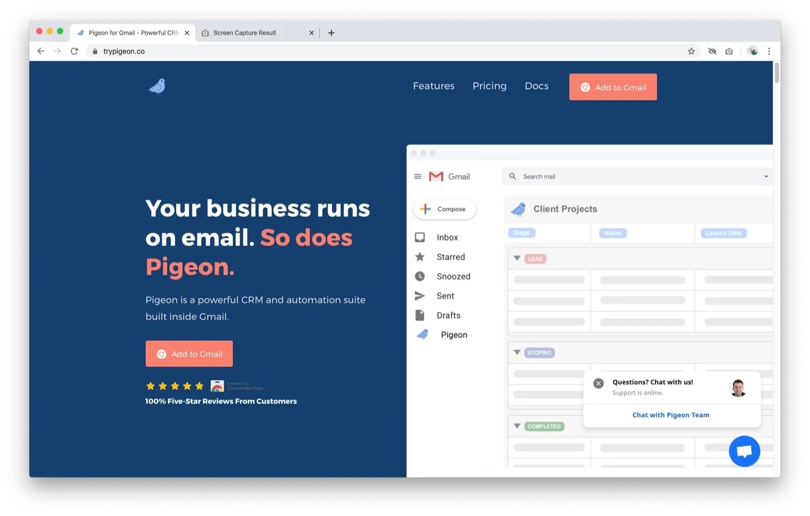
Here’s Pigeon’s first screen:
-
The first thing I notice is the title, which reads “Your business runs on email. So does Pigeon.”
-
I’m not sure what Pigeon does other than it having to do with my email
-
While the subtitle answers the “What is this?” question, I think the title can do a better job of telling me more about Pigeon and why it’s great
- For example, this could highlight a common problem or pain point solved by Pigeon (e.g. “Never forget to follow up with potential clients again.” or “Email hundreds of leads in seconds.”)
-
-
On the right, there’s a GIF of a mockup of Pigeon’s interface
-
Yay for visuals!
-
A short video of some really awesome feature inside Pigeon would work better here because it’d give me a better idea of what the value is
- I’m imagining seeing something that makes me think, “Wow. That would be a game-changer.”
-
The mockup GIF kind of gives me an idea of how Pigeon looks and works but I’d like to see a more high-fidelity image or video
-
-
Overall
- The biggest opportunity is to answer the “Why should I care?” question with the title and example GIF
Everything Else
From here on out, I’ll attach annotated screenshots of the page as I scroll down.
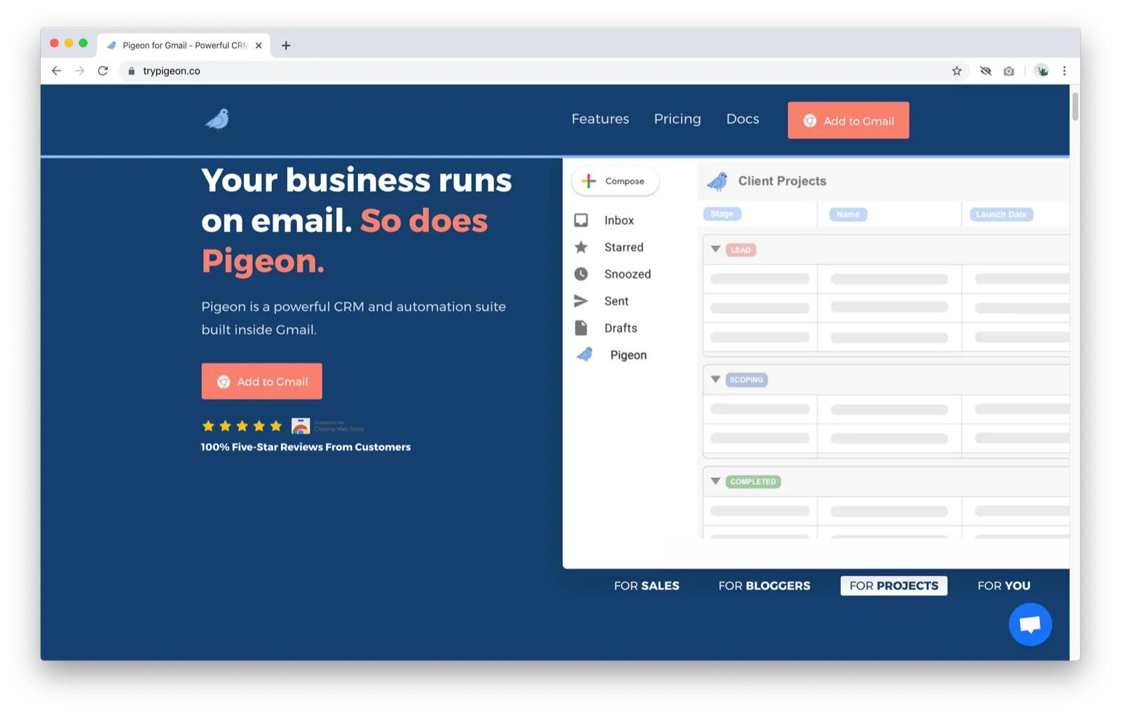
- I just noticed while scrolling down the page that the animated GIF goes through different scenarios based on the user type (look below the image)
- I totally didn’t see that when the page loaded because it’s below the fold. It’d help to make it visible by moving it above the image / resizing the image / etc. (I’m using a 13” MacBook Pro)
-
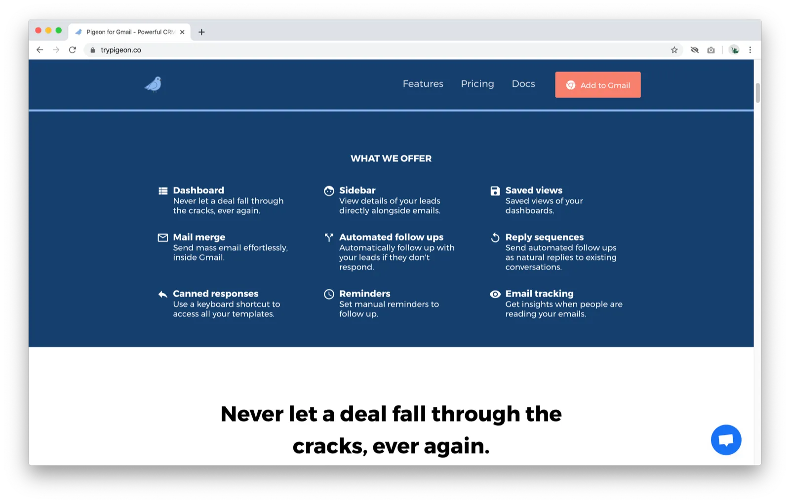
My eyes didn’t know where to go when I saw all the things under “What We Offer”
- It’s really amazing how much Pigeon does (this thing is like having 10 extensions in one), but I think there are better ways to showcase it than to list all the features like this
- Something like this seems more appropriate near the end when I might want to be impressed by all that Pigeon has to offer. Right now, I still don’t really know why I’d want it and I’d like to see examples rather than read about them. Would love to see more “show, don’t tell” happening here.
-
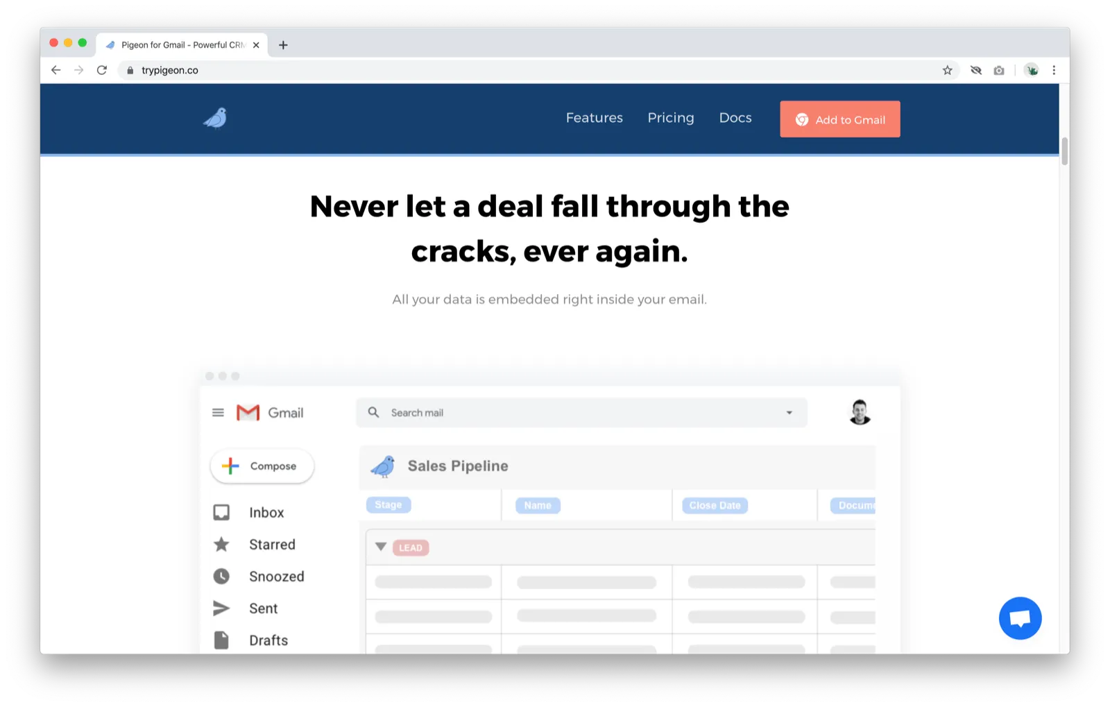
Ah great! This heading explains what kind of problems Pigeon can solve for me
- Would be great to show this kind of info much earlier (e.g. first screen title)
-
The image is the same one that I saw on the first screen and doesn’t really provide any new information
- Again, seeing real product screenshots (even with mock data / blurred out details) rather than mockups would give me a much better idea of what the product looks like
-
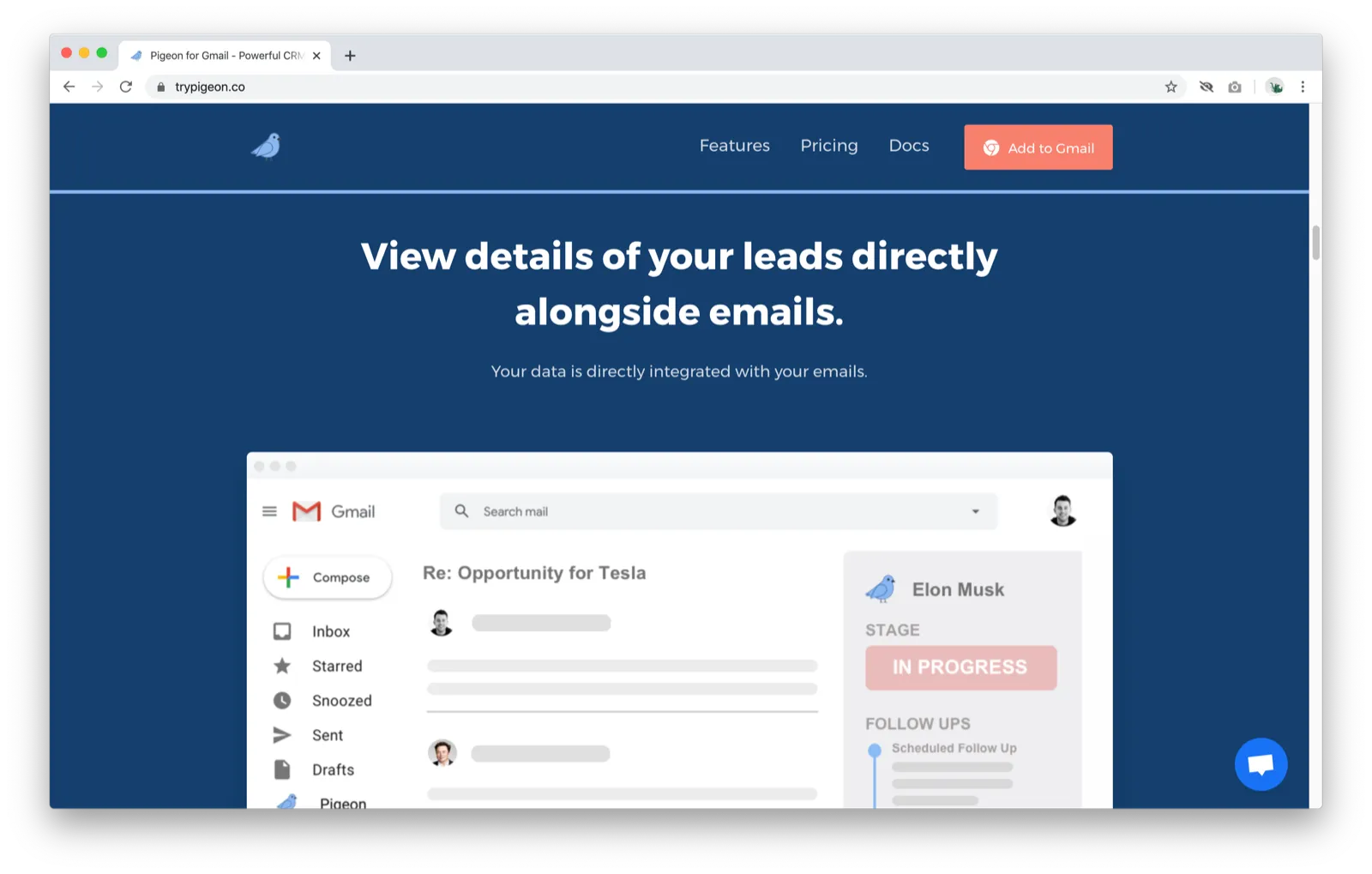
The image is way too big on my screen because I have to scroll to see the whole thing
- Especially since there’s not much detail for me to look at, I’d prefer it to be smaller
-
Neat, seeing contextual contact info is a great feature
-
I just realized from staring at the mockup a bit more that this features is about having details of your interactions with your leads, not about having details about your leads (e.g. links to their website, Twitter, LinkedIn, etc. like Rapportive). This might not be clear to others as well.
-
Copy for both the heading and the subheading can be stronger
-
While “View details” hints at a pain point it’s solving, it’d be much more effective to address it directly to make it more enticing
- e.g. “Remember the details of every interaction with every lead”
-
-
-
Again, image is too big on my screen and would like to see real product screenshots
- I’ll stop repeating these points now because you get the idea :)
-
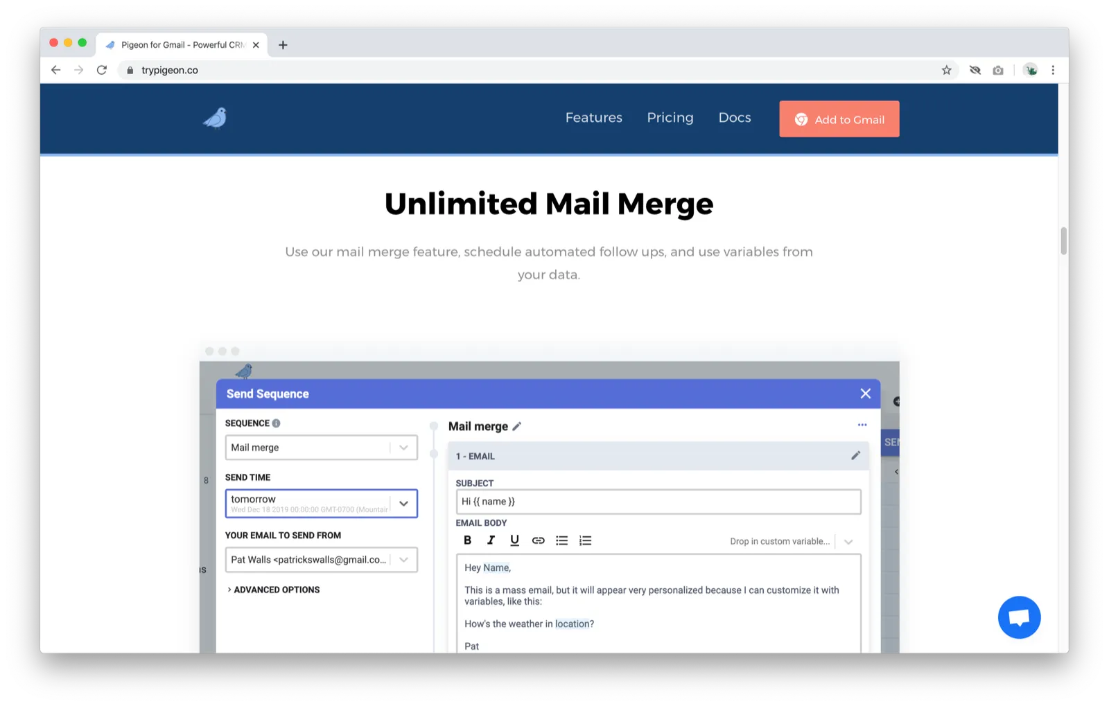
Yay, a screenshot!
-
I’m not the target audience for this so take this with a grain of salt, but I didn’t know what “mail merge” was up until recently
- It could be more effective to highlight what mail merge allows you to do (send lots of personalized emails with almost no effort) rather than naming the feature
Okay, there are six more of these <feature> + <screenshot> combinations and I’d like to get to the actual product so I’m going to skip them. (Having nine total full-screen explanations of features also might be more than most users are willing to go through.)
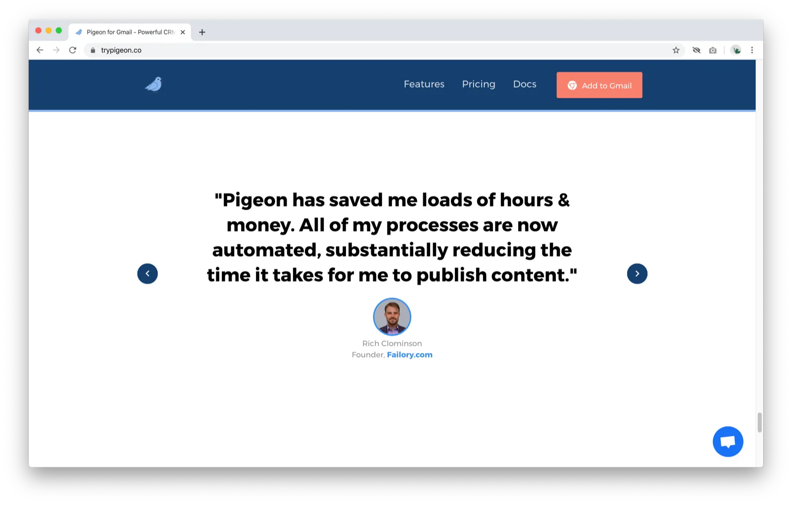
- Testimonials are great
- Could be more effective to bold certain parts of the testimonial you want to highlight rather than the whole thing (e.g. “saved me loads of hours & money” for the one above)
- Small nitpick: The previous and next buttons shift vertically as I click through the testimonials rather than staying in the same place
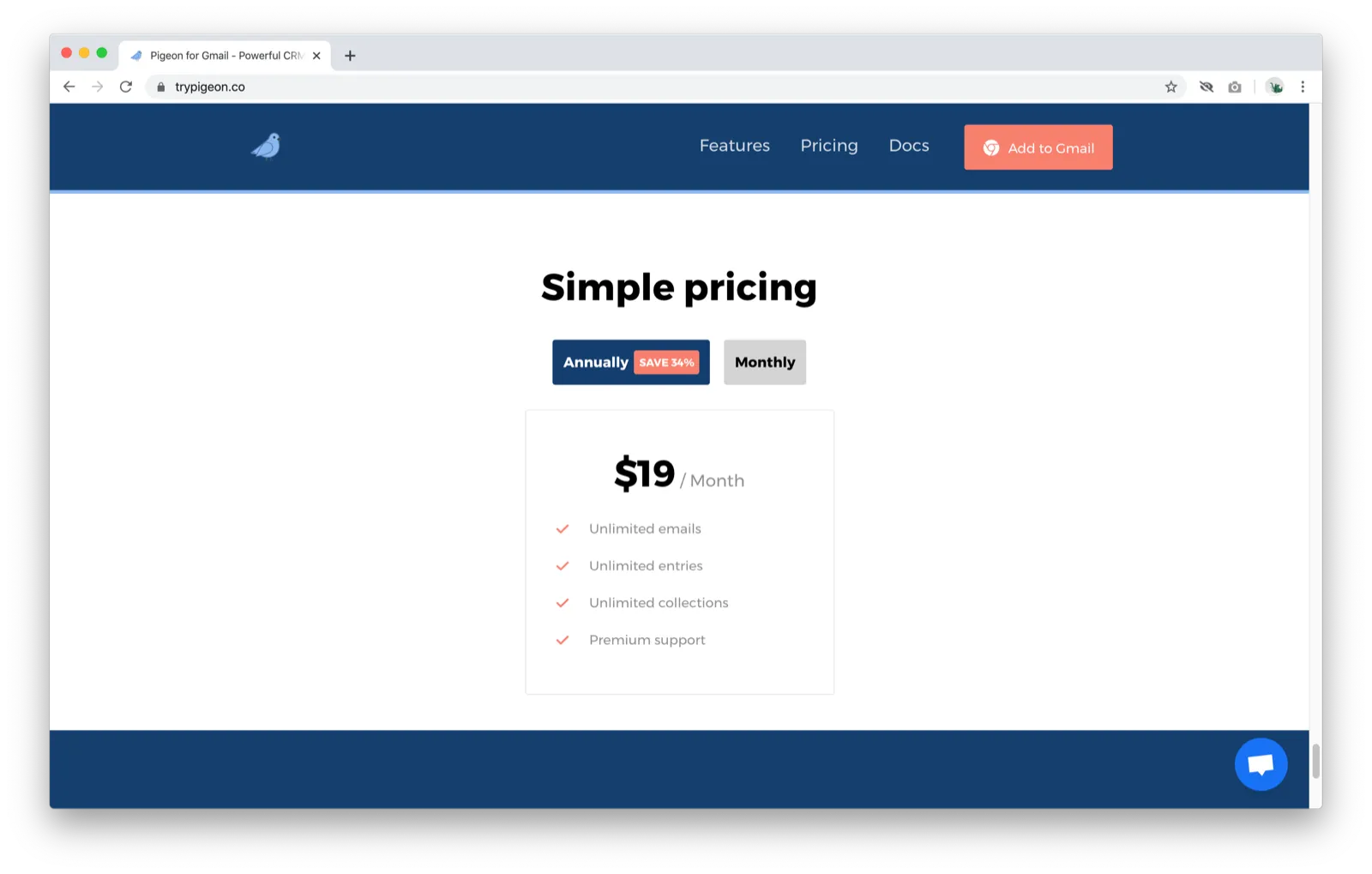
- Not clear if there’s a free plan. I’d like to try it before paying, but there’s no mention of a free plan or trial here.
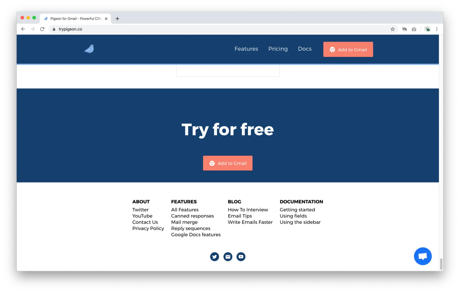
- Oh, I can try for free. Since the pricing section only listed a paid plan, it’s not clear what exactly can I try for free. Do I get a limited set of features or do I only get to try it for a certain number of days, etc.?
Product
I’m an hour and 30 minutes into this post (wow, this took much longer than I expected) but let’s get to the actual product!
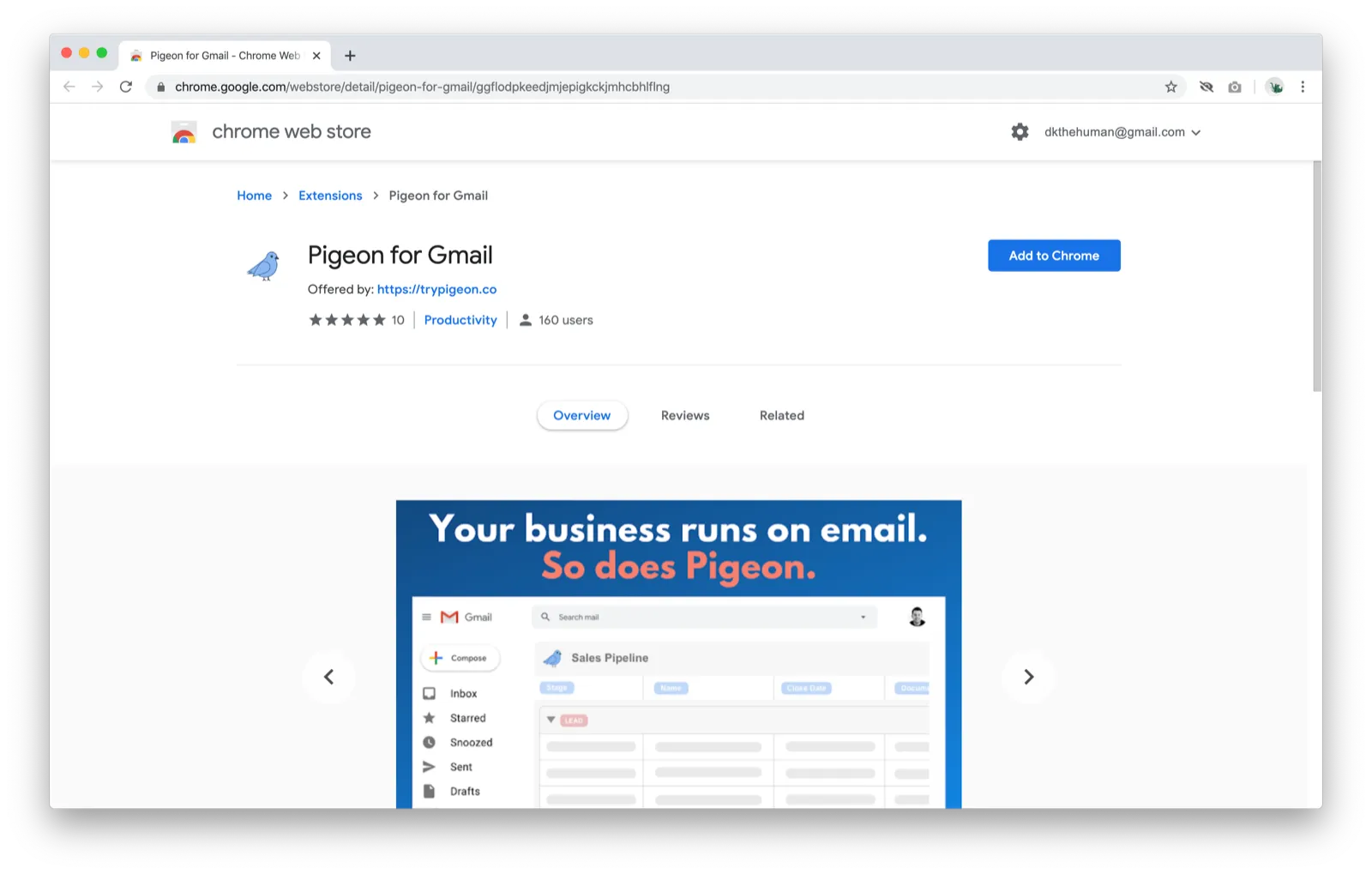
- Clicking “Add to Chrome”
-
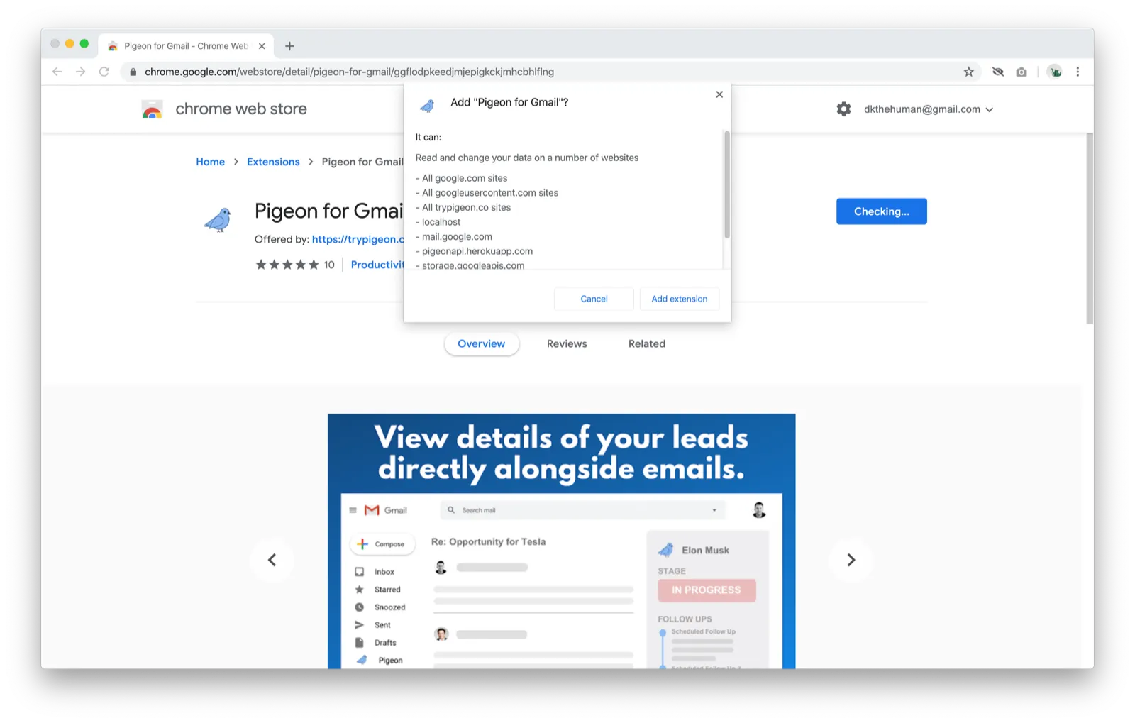
Wow, there’s a lot being asked for here
- I don’t get why anything beyond “mail.google.com” is required
- Having “localhost” there makes me feel less sure about the product because it makes me think that there wasn’t that much care put into the permissions (and therefore my privacy)
- I’m definitely a lot more privacy-sensitive than your average user, so most people probably don’t care about this
-
Clicking “Add extension”
-
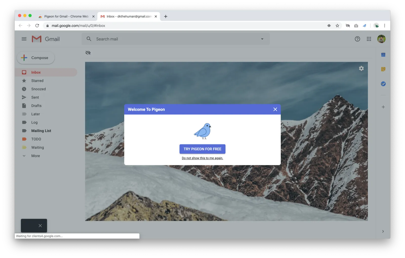
Installing Pigeon opens Gmail in a new tab
- (My inbox is hidden by that picture because of Hide Feed. Might need to turn it off to try Pigeon properly.)
-
Not sure what the point of this dialog is. Aren’t I already trying Pigeon for free? Seems like it’d be better to have onboarding information here.
- What happens if I click the “X” or “Do not show this to me again”? Do I not go through an onboarding flow?
-
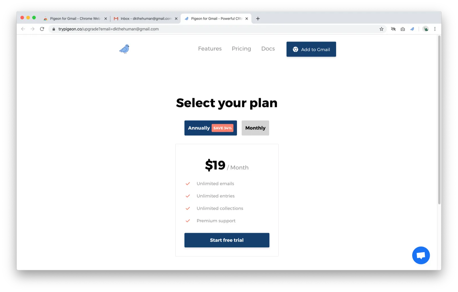
Clicking “Try Pigeon for free”
-
Wait, what? Why am I being asked to pay? I thought I get to try this for free.
-
Normally, I would’ve exited this page and uninstalled the extension due to the confusion but I looked at this page longer and saw the “Start free trial” button
- My eyes were immediately drawn by the price, and I assumed that clicking any button would mean getting charged
-
Clicking “Start free trial”
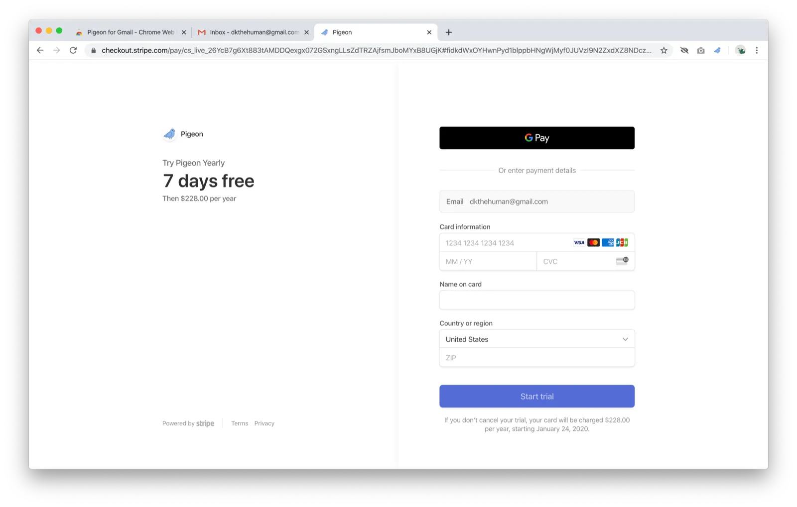
- Oof, this feels scary. I’m definitely not ready to put my credit card info anywhere because I don’t know if this tool is worth it since I haven’t tried it
- I’m going to leave this page and see if I can see whether I can try Pigeon back on my Gmail page
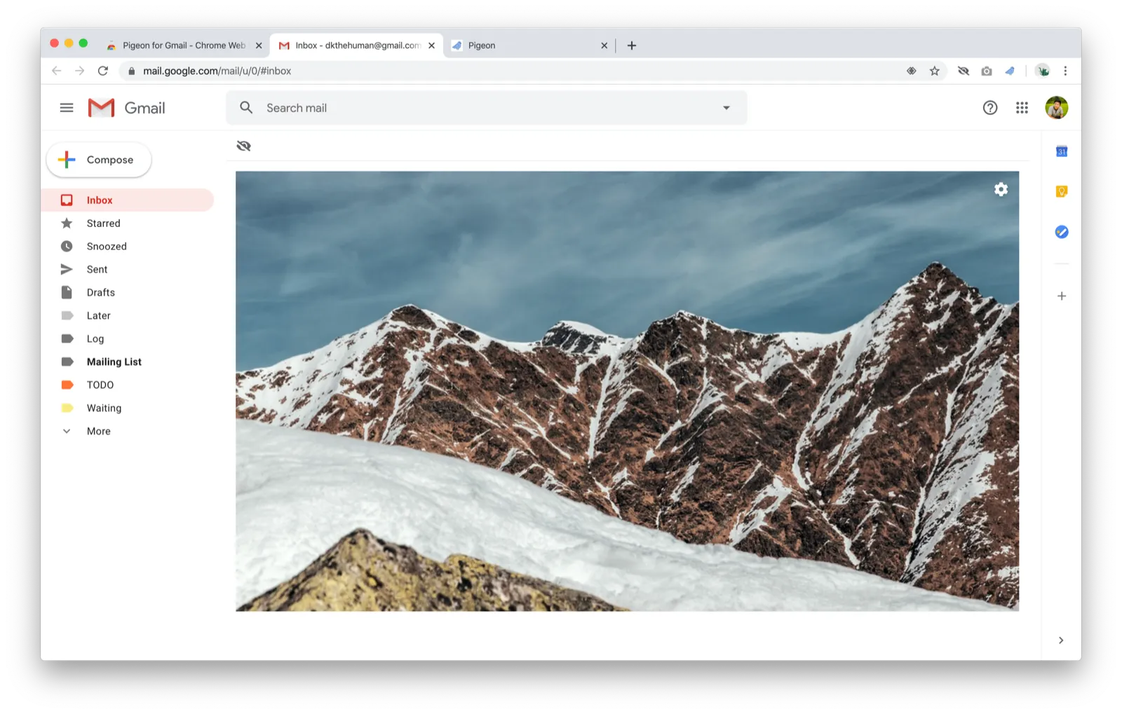
- Hm, nothing here. I expected “Pigeon” to be in the left sidebar like I saw in all those mocks but it seems that I need to pay to get anything working.
I considered putting my credit card info just to keep the product feedback going, but I think this is enough feedback for now and I think the $228.00 per year requirement to try the extension is a hurdle that many people won’t get past. I think Pigeon would benefit from having a limited free plan where users can experience the benefits of Pigeon before they have to put in their credit card information. I previously wrote about different paid plan models for Chrome extensions and I think a usage-based or feature-based model makes a lot more sense for Pigeon than the free trial model.
Even though I didn’t really get to try it, it seems that Pigeon has a ton to offer and I’m excited to see where it goes. Good luck, Pat!