Day 95: Hide Feed's Leaky Bucket
One of the questions I’m working through is one that every maker asks themselves with dread after spending weeks or months building a product : How do I get more users?
To answer it, I’m going to simplify the process of growing my users to a 2-step funnel:
- Acquisition: Am I getting new users?
- Retention: Am I keeping existing users?
If having a thriving user base is like having a full bucket, acquisition is about finding ways to add water to your bucket, and retention is about keeping the water that’s there.
Unfortunately for me, Hide Feed has problems with both acquisition and retention. I’m basically carrying a broken bucket in a drought.
Which step of the funnel should I focus on first? Previously, I wrote about how the most common reason people uninstall Hide Feed is because they don’t want to pay. And it’s not just a few people here and there — over a month-long period, I had 168 people install Hide Feed and 100 people uninstall it. It doesn’t make much sense to try to pour water into my bucket when I know that it’s all going to leak out. Retention it is.
At first, it was perplexing that so many people were uninstalling Hide Feed saying that they didn’t want to pay given that there’s a free plan, but there’s a simple explanation: They don’t know about the free plan.
When I first designed Hide Feed’s landing page, I had the pricing plans included in the bottom of the site to make it clear that there was a free plan and a paid plan. But when I tested it with users, I got feedback that they didn’t care about pricing when they didn’t even know what it was. That made sense, so I simplified the landing page to drive users to install the extension and put pricing information on a separate page entirely:
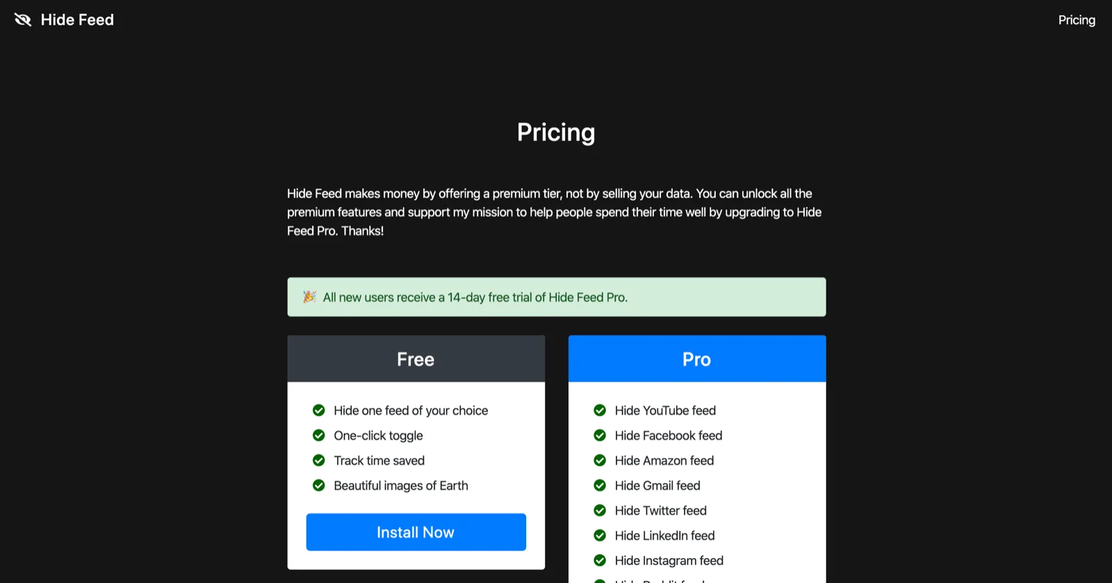
Even though I mention the existence of a premium tier in the onboarding flow inside the product (“Hide Feed makes money by offering a premium tier, not by selling your data.”) and include a “Plans” section in the options page, it’s probable that most users don’t read or discover any of that. In that scenario, the only time they’d find out that there’s even a paid plan is when they get a notification a day before their 14-day Pro trial runs out saying that they’re about to lose access to Hide Feed Pro (or worse, they miss the notification and Hide Feed just stops working for them).
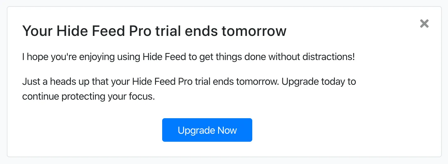
Okay, maybe not so surprising that people don’t know about the free plan.
I recently added additional text to explain that there’s a Basic plan:
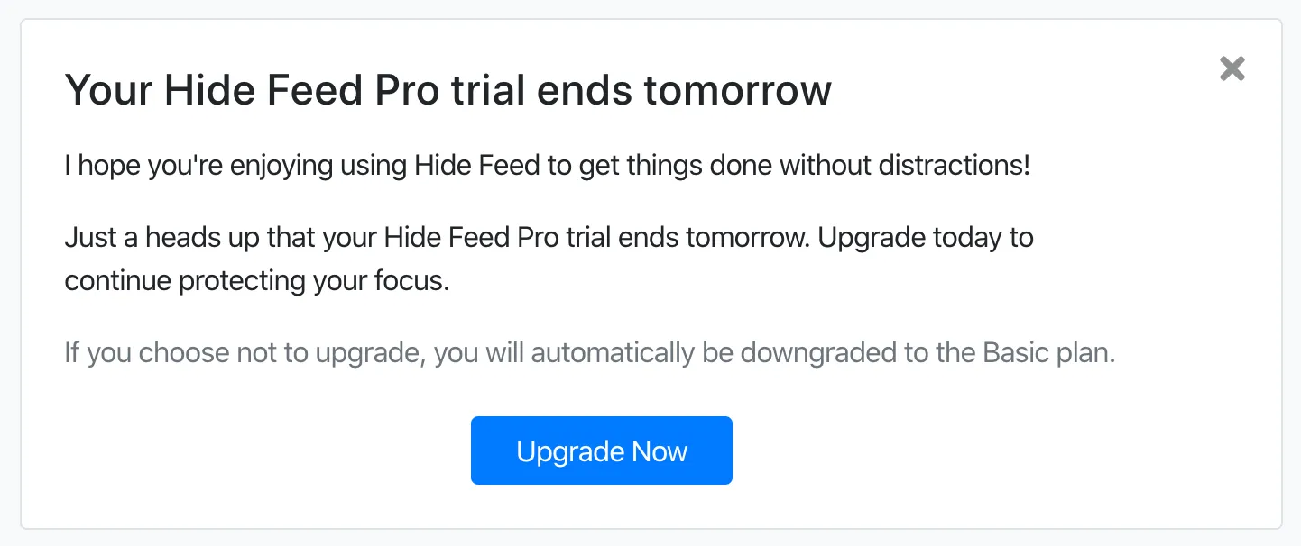
But this feels like pressing a post-it note really hard against a gaping hole in my bucket and hoping it will stop the leak — it’s not enough. I think many people will still feel disappointed upon seeing the upgrade notification because all the functionality that they thought was free was merely a trial.
I still think it’s a good idea to keep the landing page simple and focused on installing Hide Feed, so that leaves one option: explaining the plans more prominently in-product.
An extension that uses this approach is Grammarly. In their onboarding flow, they compare their free and premium plans:
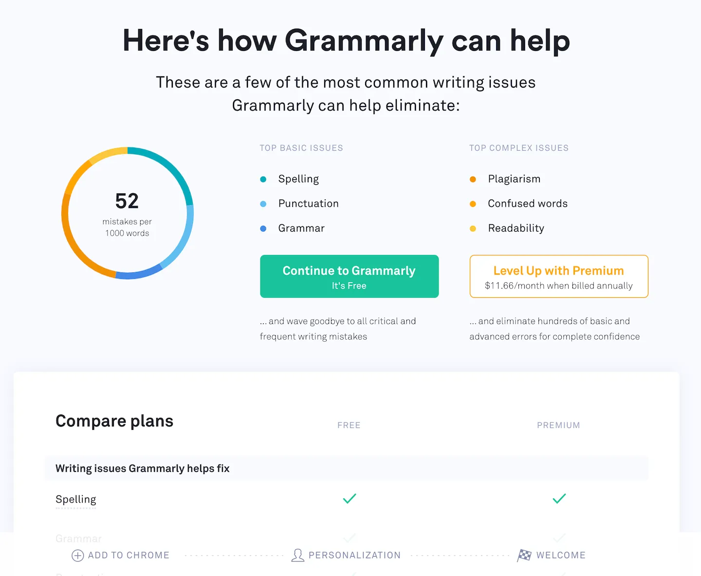
I’d guess that very, very few people upgrade here because they haven’t yet seen the value in the service. But this screen serves the important function of letting the user know that there is a paid plan so that they’re not surprised about having some features be gated. That awareness seems especially important given that they much they advertise Grammarly being free on their landing page:
![The word “free” appears 4 times on their landing page, and the page title is “Grammarly: Free Online Writing […]”](/_astro/0bc7883a42714ebb.BpDPwTZW_13QwuW.webp)
My plan is to add a similar screen to Hide Feed’s onboarding where I show both the free and paid plan and encourage people to try out a 14-day free trial of the Pro plan. While this means that some people will probably never experience the Pro features because they don’t want to even want to flirt with a paid plan, I’m hoping that this will fix the leaky bucket.
If it doesn’t, then… I’ll have to brainstorm some other ideas.
It’s also hard to tell whether the Basic plan is appealing to people. Most extensions with similar functionality of hiding feeds only support a single site, so it seems like the Basic plan would be strictly superior to those options due to not only being able to hide feeds but replacing them with a beautiful images and having a place to put today’s focus, but it also feels quite limited compared to the Pro plan, which supports nine sites.