Day 17: What I got wrong about Hide Feed
You’re reading part 3 of my User Testing for Indie Makers series:
- Part 1: User Test or Die (Why User Testing Matters)
- Part 2: Bribing Strangers with Protein Bars (How to Get Users for Testing)
- Part 3: What I Got Wrong About Hide Feed (What I Learned from User Testing)
- Part 4: User Testing Best Practices
“Can you show me what you’d do to show the feed?”
He moved the mouse cursor over to the extension icon and clicked it. In the popup that opened, he clicked the switch that disabled the entire site.
Damn it. Despite the videos on the marketing page and the explicit instruction in the onboarding flow about clicking the toggle integrated into the page (complete with screenshots!), everyone went straight to the extension toolbar when asked to show the feed. My design wasn’t working. And I had spent so much time building out the native integration, too.
When working on products, I use the following principle: Use your intuition, but make sure to test it. At Google, I had seen how in many teams, the absence of product intuition and vision led to stale products that lacked inspiration. Being data-driven sounds great until you realize that much of the time, people use it to assure themselves and others that the ship’s headed in the right direction, when in fact, they have no destination in mind.
Being an indie maker can be intoxicating because you have the full power to manifest the product that you want to see in the world. Want to completely redesign how something works? No problem; it’s just a code change away. No long email threads. No meetings. No one to convince. You’re Michelangelo discovering David inside a block of marble. Just pick up the chisel.
As an indie maker, you can move impressively fast, but you’ll often find that you’ve been running in the wrong direction. That’s the cost of working alone: you miss hearing other people’s great ideas or having them quickly identify problems in yours.
User testing can be the reality check that helps you identify core issues and opportunities for improvement in your product.
During user tests for Hide Feed, I discovered many areas where my intuition had been wrong, and I’ll list some of them here to give a sense of the types of things you might discover by running user tests yourself (side note: I’ve somehow slipped back into the prescriptive voice and I don’t like it, so that stops now).
Website
Expand to view screenshot of the whole website
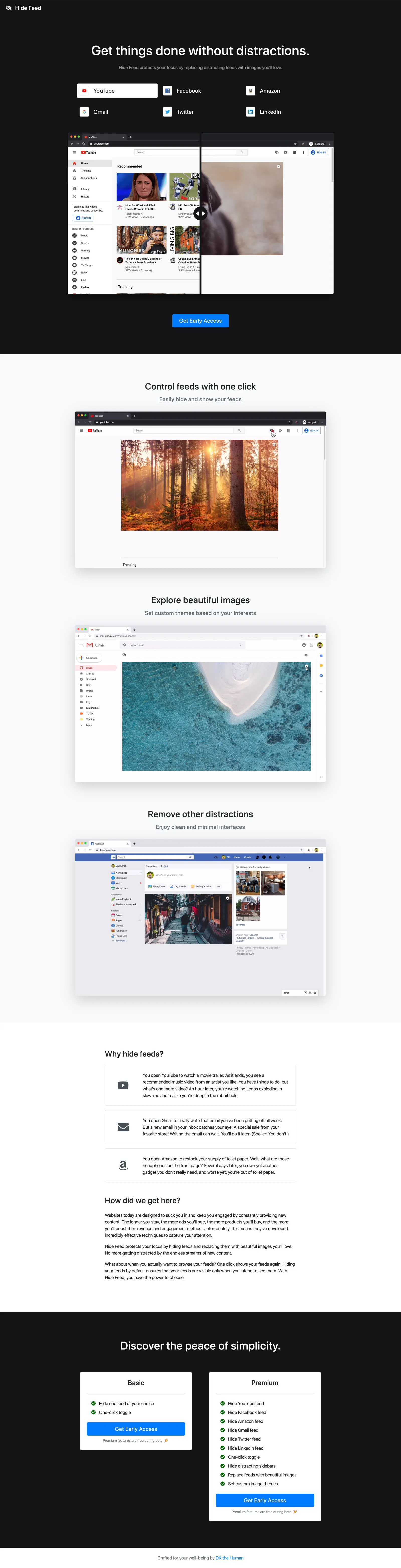
Netlify keeps backups of all my website builds, so you actually play around with the version people saw during my user testing here: https://5e1e0479190a7b0007cb8b72–hidefeed.netlify.com/
Initial screen
On the Hide Feed website, I want people to be able to immediately see the difference that Hide Feed makes. I loved what Ryzal did with providing a before and after comparison slider in Reader Mode’s landing page, so I built the same thing for all the different sites supported by Hide Feed:
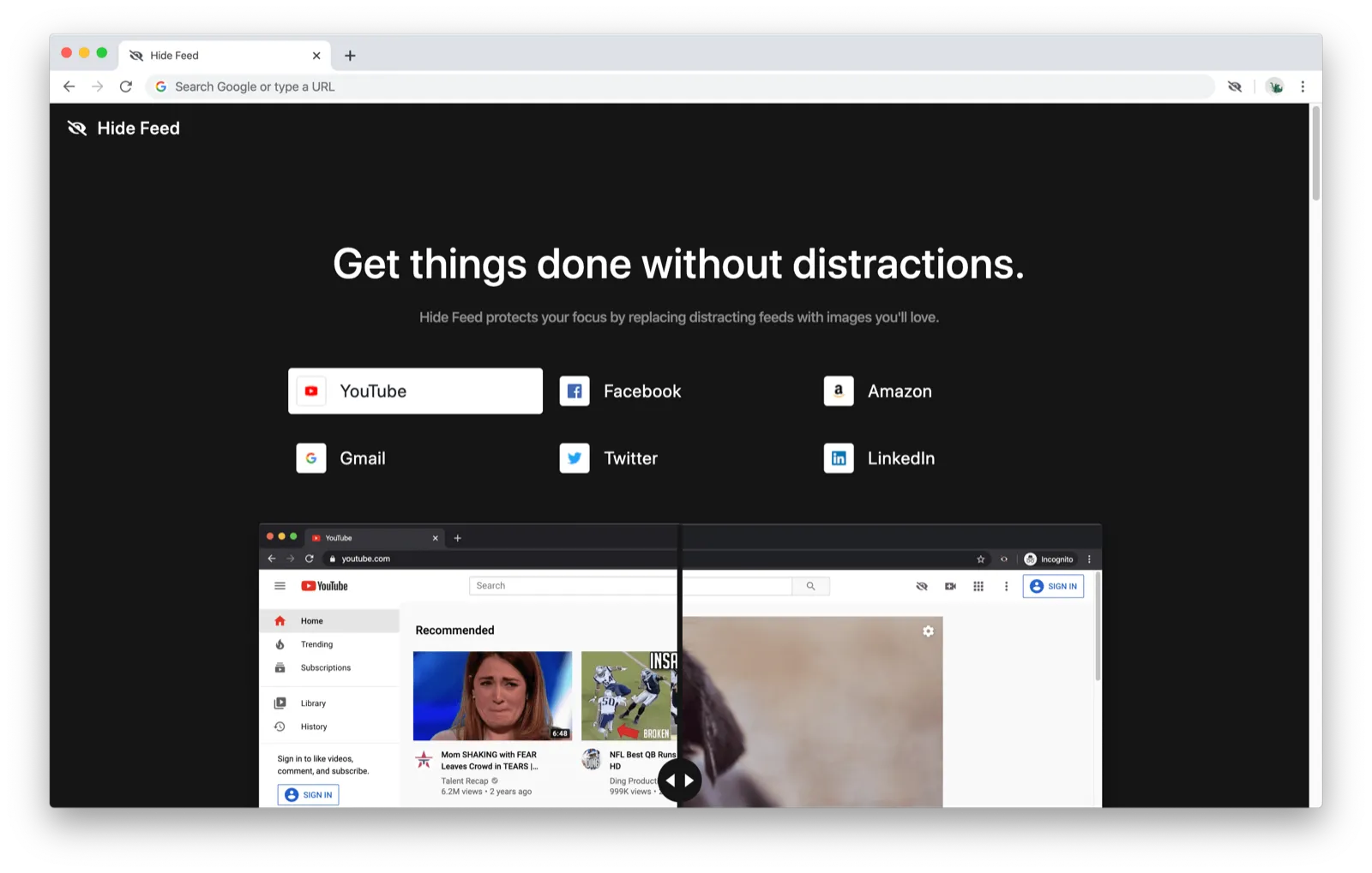
Every 3 seconds, the next website is selected and the before and after images update accordingly. Here’s what I hoped would happen:
- People play around with the slider
- They click on all the other sites and play around with the slider for them, too
- They say “oh wow, this is super cool how do I buy this right now”
Here’s what actually happened:
- 3 out of 4 people played around with the slider (the handle shakes periodically to make it obvious that you can interact with it)
- 0 out of 4 people chose another site to view
When I asked them about it later, I found out that no one knew that you could click on the other sites to view their examples as well. I had hoped that the automatic rotation would make it clear that the other sites could be selected, but most people didn’t notice the rotation because they just interacted with the slider right away. (And I had made it so that once you interact with the slider, the rotation stops.)
Action items:
- Redesign slider section to make it obvious that other sites could be viewed
One user scrolled through the entire site, scrolled all the way back up, and then turned to me and said, “I don’t get it. What is this?” She didn’t know that this was a page for a browser extension, much less what the browser extension did. I think this is due in part to the call-to-action being “Get Early Access” (because it’s in beta) rather than “Install on Google Chrome” (which it will be changed to for launch), but I think that the website can do a much better job communicating that this is for a browser extension and explaining what it does.
Action items:
- Explain that this is a browser extension more clearly
- Explain what the browser extension does more clearly
Demo videos
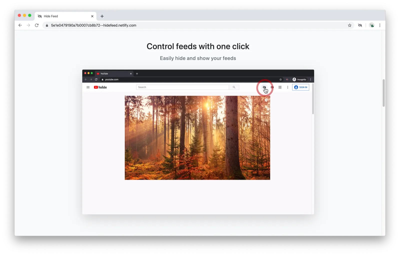
Thankfully, people stopped and watched the demo videos. Having short videos that autoplay (without sound) seems to be a good way to show how the extension works and showcase the features.
Explanation
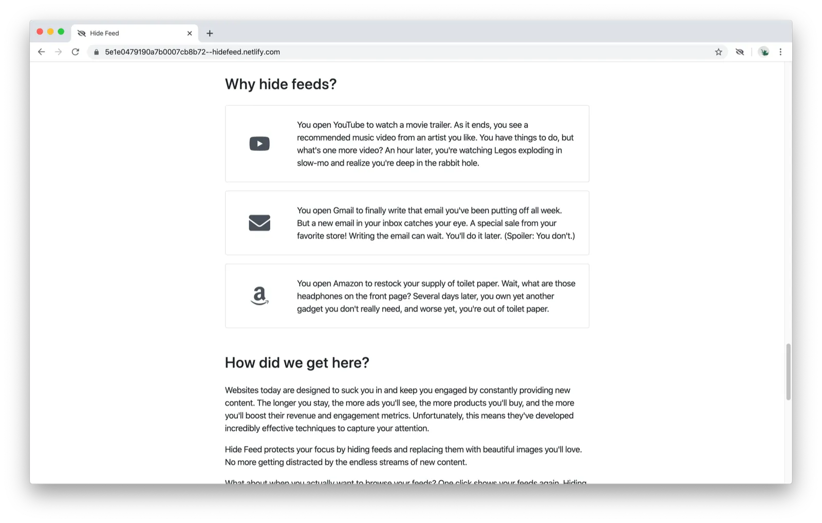
I had a section that explains different use cases for the extension and the motivation behind building it. I didn’t think many people would take the time to actually read through this, and I was right — 3/4 testers skipped right past it.
Action items:
- Explain use cases in a more digestible way
Pricing
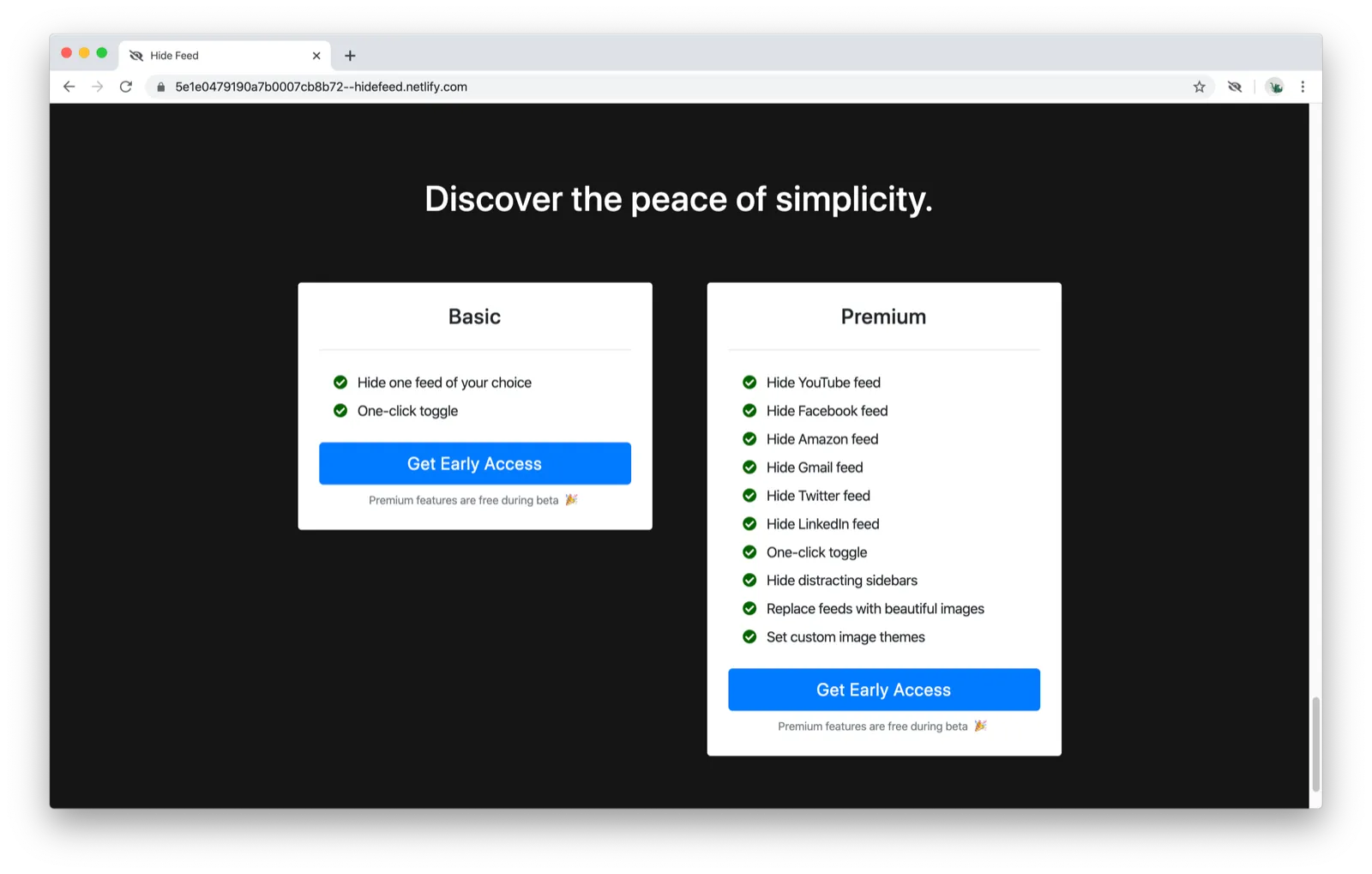
Several users were initially confused by what “hide one feed of your choice” meant but figured it out in the middle of asking me about it. I was a bit surprised by that because I thought that the feature-based model would be easy to understand, but it looks like the messaging still needs improvement.
One user was confused because the prices weren’t listed, and I told him that it’s because it’s in beta. He commented that it seemed like it wasn’t useful to show this at this stage because the user hasn’t even tried the extension, and I immediately realized he was right. What I want people to do at this stage is to try the extension, not pay for it. It later occurred to me that this might also solve the problem of “hide one feed of your choice” not making sense. If people come to the pricing page after having used the extension, they’d likely have a better understanding of what that actually means.
Action items:
- Make installing the extension the only call-to-action on the page — move pricing to a separate page
Extension
After they’d gone through the website, I asked users to try the extension as if they’d just installed it.
Add sites
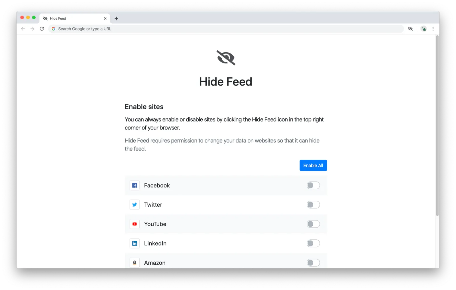
The first screen is to enable sites to use with Hide Feed.
3/4 users enabled sites without commenting at all about the permissions prompt that pops up:
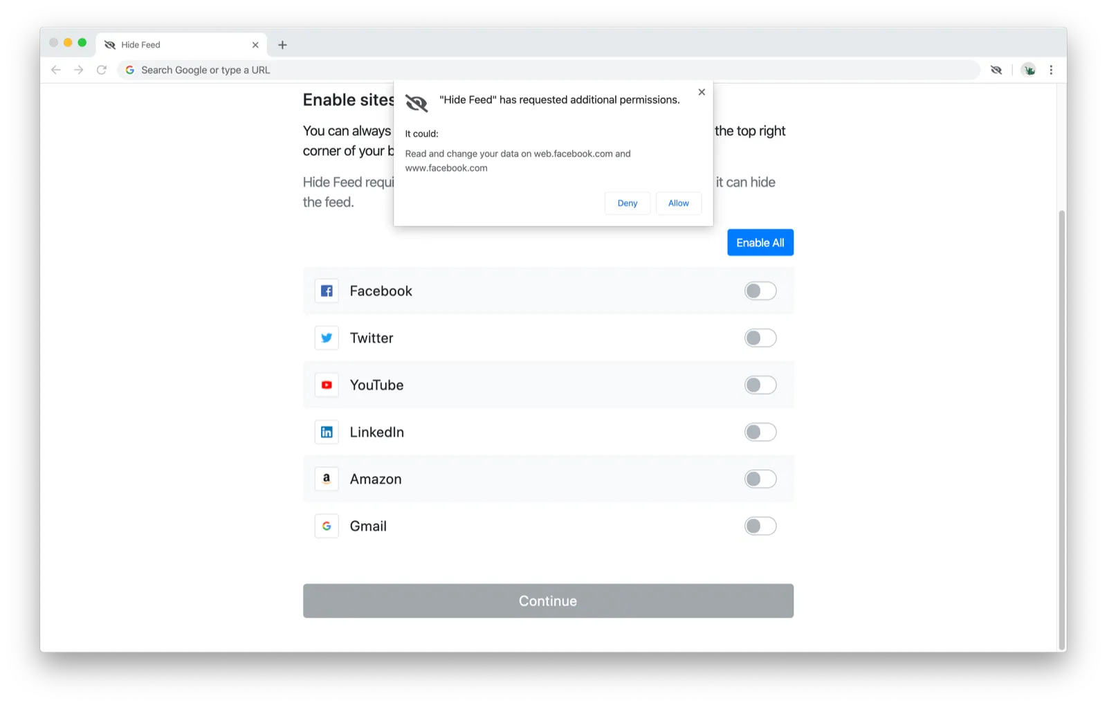
They were probably much less sensitive to it than they normally would be because they’re just testing the extension (on my computer, no less).
One user asked, “Are you collecting my browsing data?” upon seeing the permissions prompt, and that showed that I could do a much better job communicating the extension’s privacy policy.
Action items:
- Add information about data usage and privacy policy in the onboarding flow to make it clear that browsing data is not being collected or transmitted
Incognito
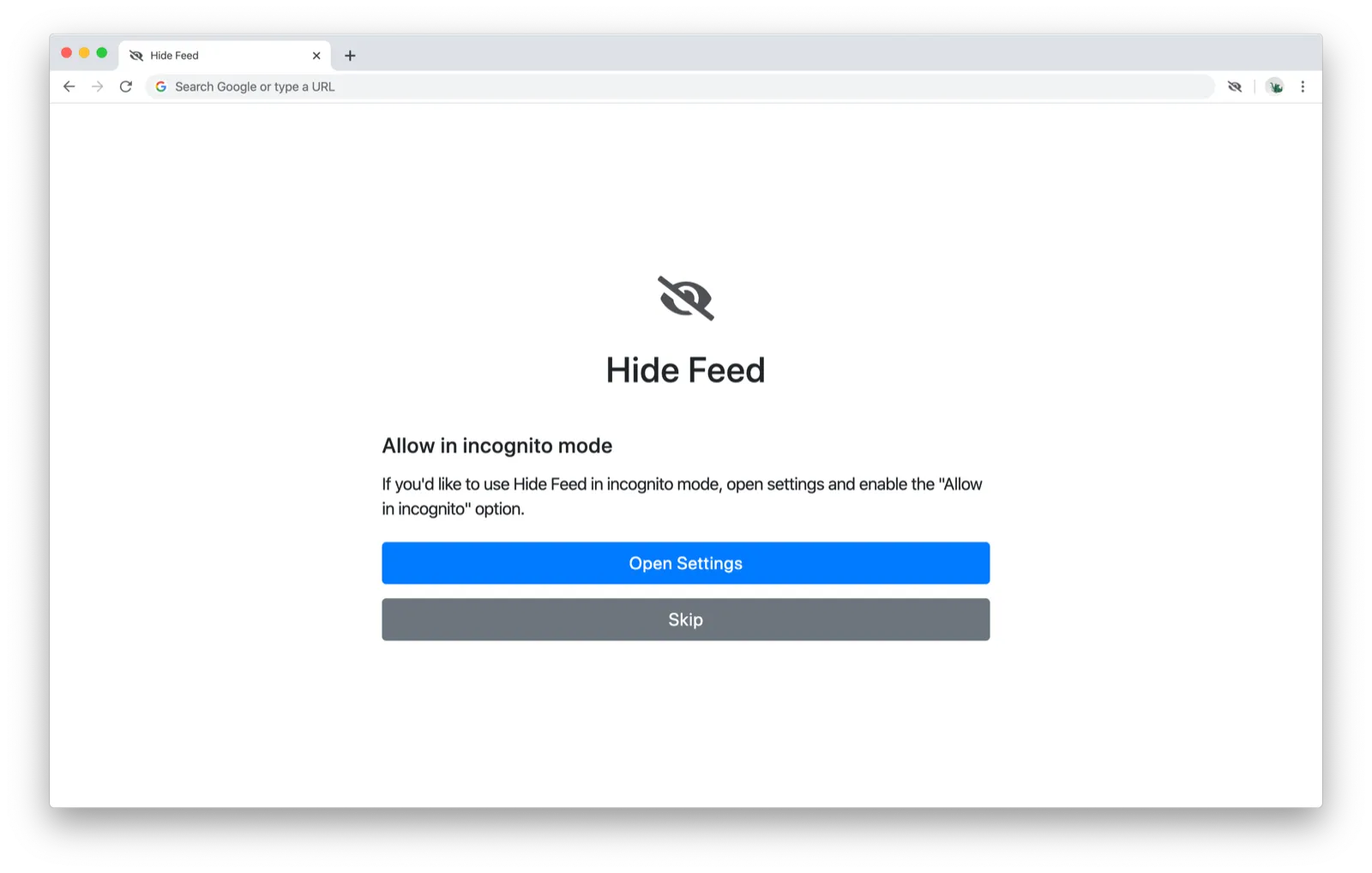
I thought it might be helpful to make it easy for users to enable Hide Feed in incognito mode, but I was dead wrong about this. 3/4 users skipped it, and one user clicked Open Settings and closed it immediately once she saw the intimidating options page:
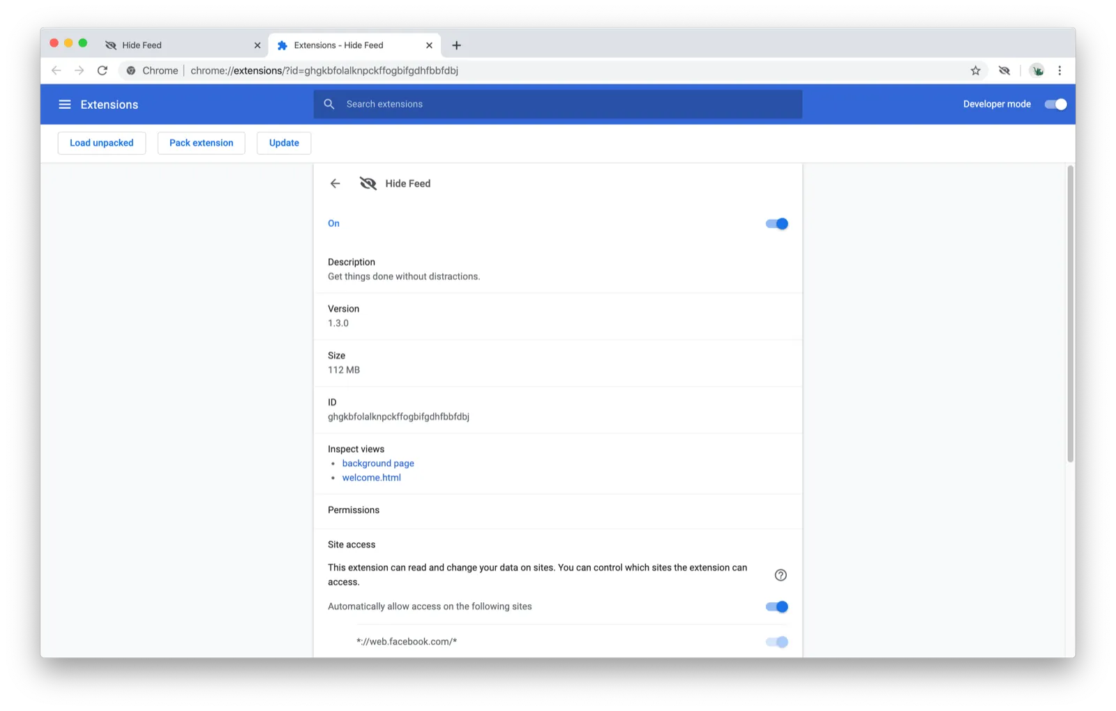
I actually added the incognito screen because I had already built the screen for Intention (my other Chrome extension designed for self-control and time management). Even though I think having the option for incognito mode might still be helpful for Intention because it will help prevent people from cheating themselves, the reaction that people had here made it clear that I either need to reword it significantly or remove it. For Hide Feed, I realized that the case for enabling it in incognito is not worth the additional step and confusion.
Action items:
- Remove incognito screen
Finish
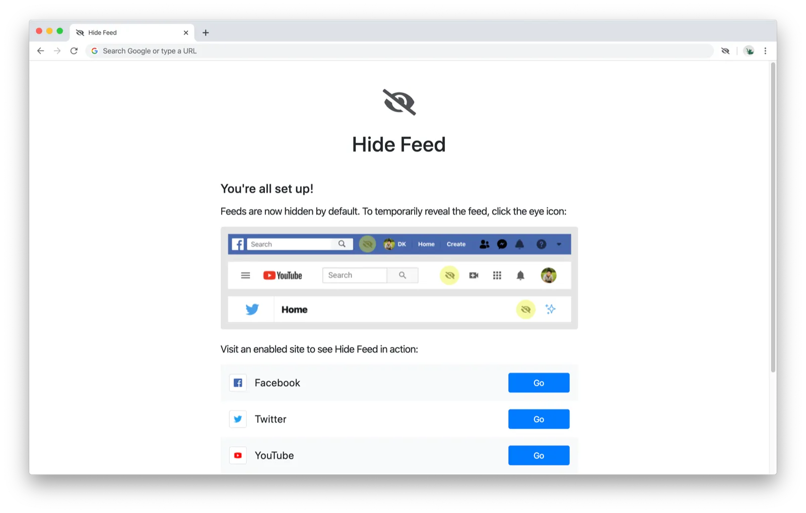
The last screen of the onboarding flow encourages users to try out Hide Feed by visiting one of their enabled sites. It includes screenshots about the integrated toggles that were wholly ineffective in communicating how to toggle the feed.
One user clicked “Go” for a site then tried to find the finish screen again in order to try out the other sites. I realized that it would probably be better to open a new tab when a site is navigated to (so that the finish screen would stay open until closed) rather than navigate there directly in the same tab.
Action items:
- Open sites in a new tab in the finish screen so users can try multiple sites easily
Usage
Now the fun part. Did people know how to use the extension?
When asked to show their feed on an enabled site, 4/4 users went to the extension icon and opened the popup.
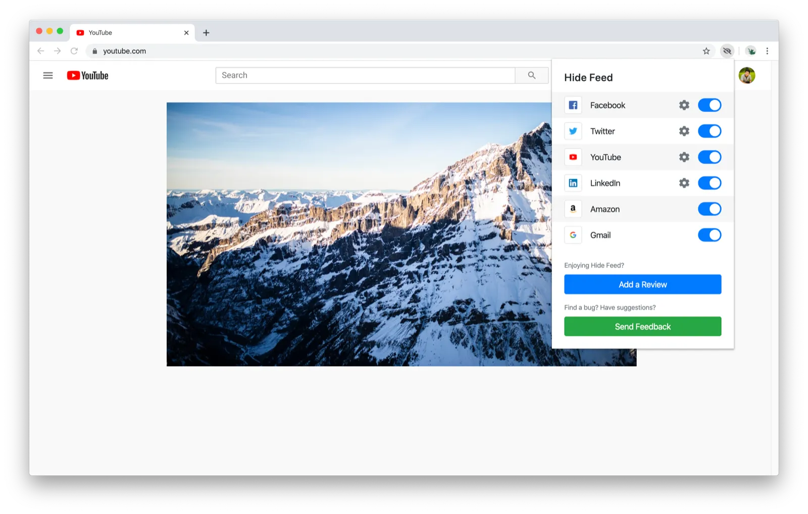
The button I was hoping they would click was the toggle integrated on the page itself (look at the left-most icon in the toolbar of icons — it’s styled to look like a native icon):
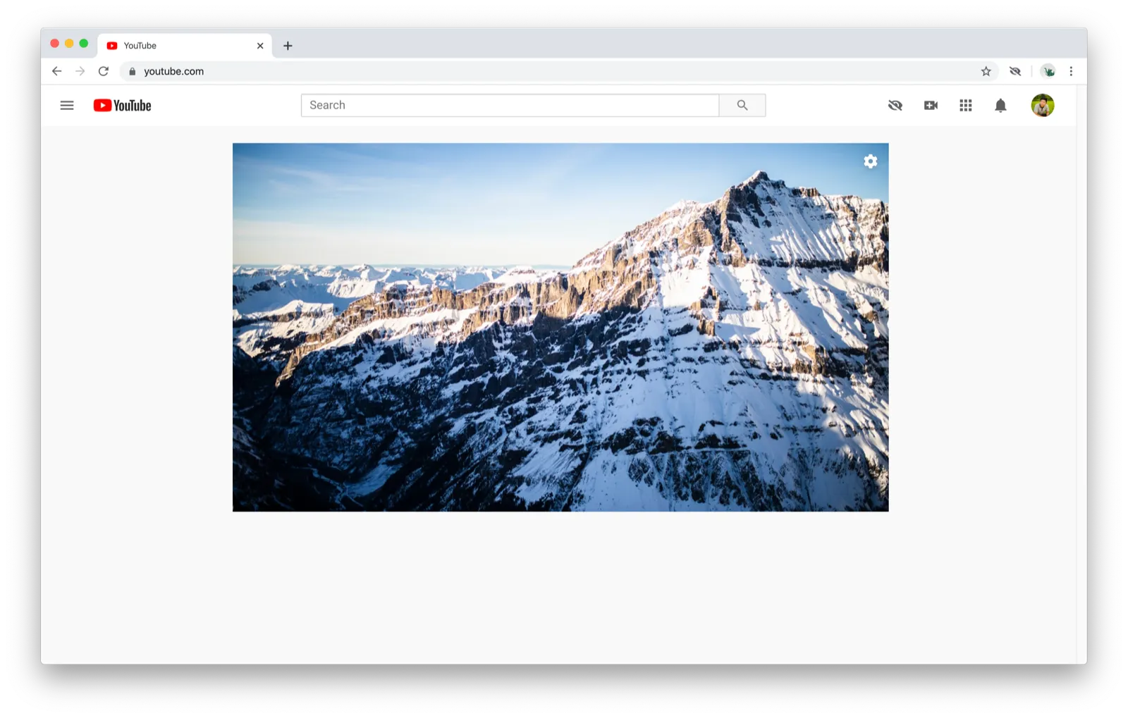
There’s actually a difference between clicking the toggle in the popup vs. using the toggle integrated in the page: The popup switch disables the site completely (and turns off additional options like hiding the sidebar) while the toggle only affects the feed. The distinction isn’t obvious because there aren’t that many additional options. People thought they had used the extension properly when they disabled the site using the extension icon.
One user noticed the integrated toggle after trying Hide Feed on his 3rd or 4th site, and then he raved about how much he loves that it’s integrated and feels like a native feature provided by the website itself. Unfortunately for him (and me, because I spent all that time building out those native-looking toggles), I think the downsides of having an integrated toggle outweighs just using the extension icon as the toggle:
- Less intuitive (people go to the extension icon first and then figure out the integrated toggle after)
- Less consistent (the toggle is integrated on a different part of the page depending on the website)
- Less maintainable (websites constantly change their designs and the integrated toggle means another set of CSS to maintain in addition to hiding the feed)
- Less debuggable (my friend sent an image of his integrated toggle pushing another element off the Facebook navigation bar whereas it works fine for me, and I’m unable to reproduce his experience)
Action items:
- Remove integrated toggle in favor of using the extension icon
Image
Users didn’t realize that the image that replaces the feed would change on every refresh, and this has been a consistent point of feedback among my beta testers. People figure it out pretty quickly since they’ll see it change when they visit the site again, but the “change theme” option probably makes no sense until they do.
One user told me that he wants to be able to upload his own images so he can see his dog or his family, and this is a feature request I’m very excited to implement. I think it’d be pretty special to be able to view images you care about whenever you visit one of the Hide Feed sites.
Action items:
- Let users add their own images
- (Optional) Add explanation about how the image and image theme work
Other
I asked people what sites they thought Hide Feed was the most useful for and which sites it was the least useful for. I got very conflicting responses, and in retrospect, it appears that Hide Feed appeals to two different types of users:
-
People who want to use Hide Feed in productivity tools but don’t have a reason for wanting it on social media sites because they just want to browse
- Most useful: Gmail, LinkedIn
- Least useful: Facebook, Twitter
-
People who want to use Hide Feed as a roadblock to mindless browsing
- Most useful: Facebook, Twitter, YouTube
- Least useful: Gmail
Of the two, I designed Hide Feed to target the first group because the other extension I’m developing, Intention, has a solution that’s much more appropriate for the second group. I myself fall more in the first group, although some of the social media sites have become “productivity” sites for me (e.g. I post on Twitter and respond to notifications and messages but don’t browse the feed that much so Hide Feed is very useful there).
I also asked people if they would pay for the extension. Here were the responses I got:
-
No — he generally doesn’t buy software. Maybe would pay if Hide Feed could work with any site of the user’s choosing.
-
No — but she thinks it would be appealing to businesses as a way to help their employees focus.
-
Yes, with caveats — “I’d pay if you had it on Instagram”
- During the user test, he was amazed at Hide Feed’s functionality and followed up to get access via the beta testing group
-
Maybe — would not pay for extension as-is but maybe would with more features
- Side note: I showed him Intention for a few minutes after the user test and he said, “I’d pay for that”
Overall, I found user testing to be an amazing use of my time and energy. With only a few testers, I discovered a surprising number of ways to improve Hide Feed. A really great outcome that I didn’t expect that was that testers continued contributing after the user tests ended — one of the testers found me the next day to tell me that he’d been thinking about Hide Feed and gave some great marketing suggestions, and another tester emailed me to send more feedback as well as the feedback from one of his close friends.
A++ would recommend
You’re reading Road to Ramen, where I think aloud and share everything I learn in exploring the question: Can I make a living building things I love?