Day 261: Designing Browserflow's Editor
It’s been a while since I’ve used R2R to think out loud about product design, but I want to start doing that again. Today I’m going to look at the editing experience in Browserflow and use examples from Zapier and Testim to compare approaches.
Let’s start with the requirements. What should a user be able to do when editing a flow?
Here are the actions that should be available when editing, in order of importance (based off of expected frequency of use):
-
Add command(s)
- Add an individual command manually
- Add commands by recording actions performed on the page
-
Edit a command
-
Delete command(s)
-
Reorder command(s)
-
Copy command(s)
-
Disable command(s)
How well does the current implementation serve those needs?
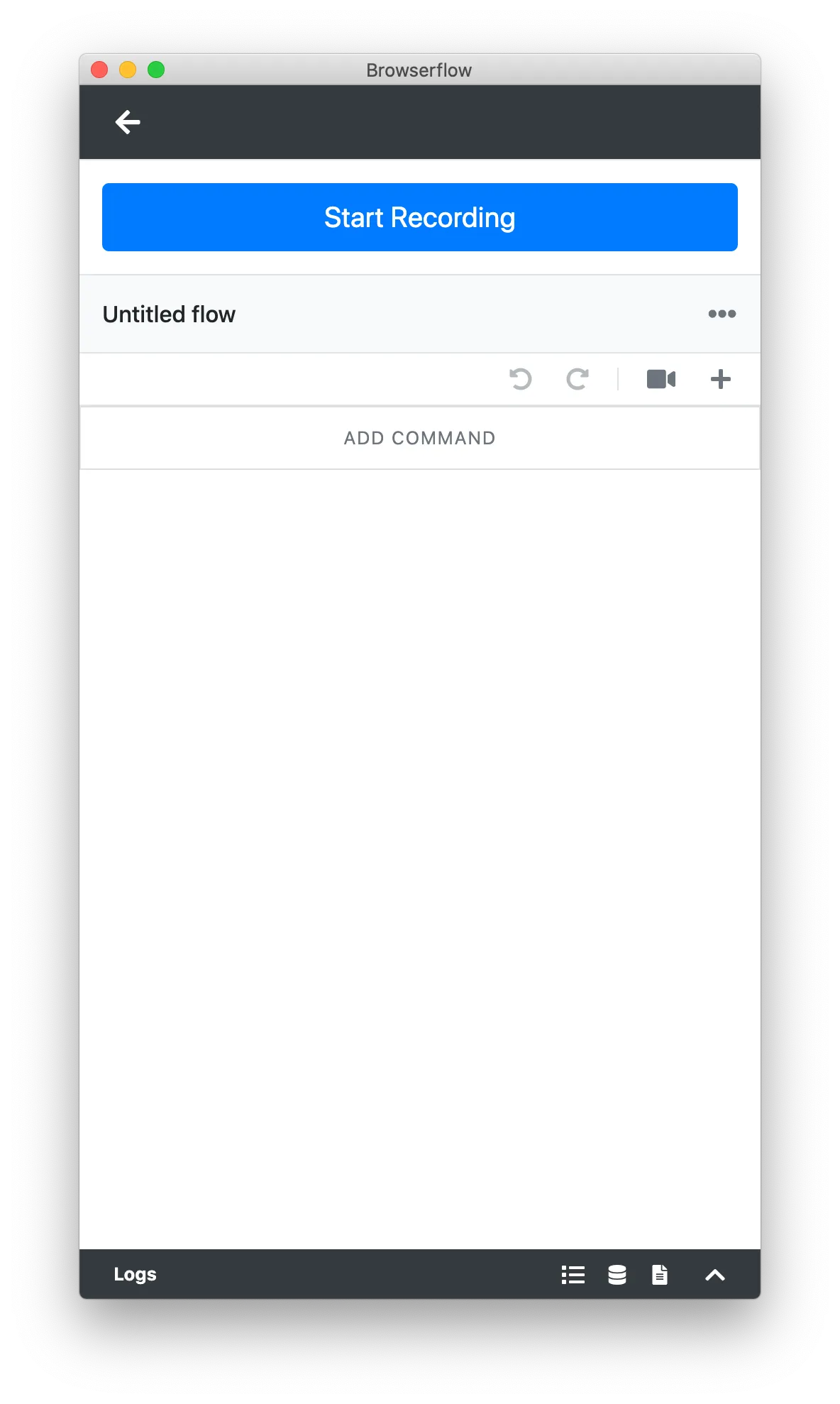
Editor with no commands (zero-state):
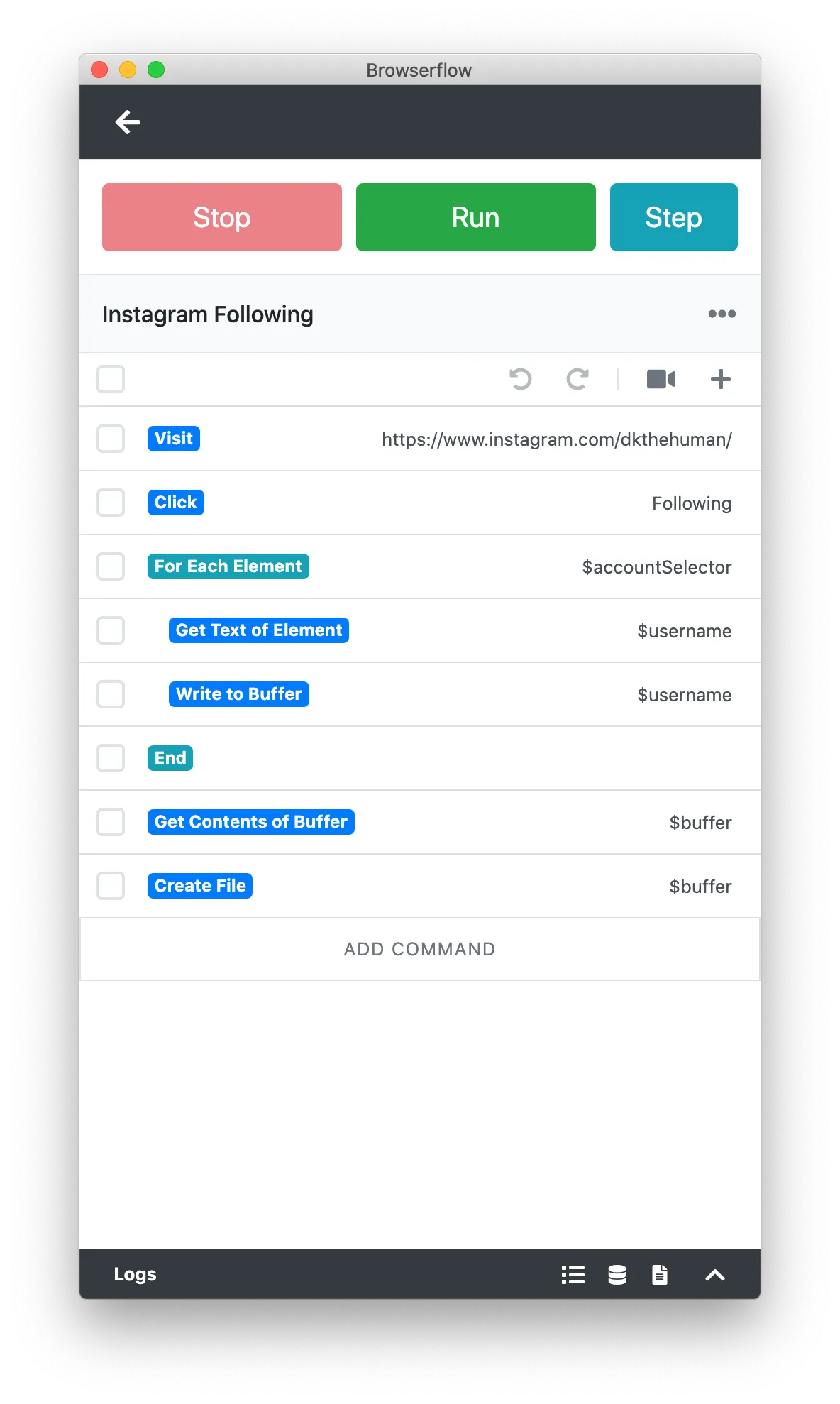
Editor with commands:
Add command(s)
Here are the steps a user must take in adding a command:
- Decide command placement (where in the flow to add the new command)
- Find and click the button to add the command
- Edit command properties
- Finish adding command
\1. Decide command placement
If you want to insert a command in any place other than the very end, you currently need to do one of the following:
-
Add a command at the end and drag it up
-
Open the command before the place you want and click the “+” button in the toolbar (but not the “Add Command” button on the bottom!)
- This isn’t really an option because it’s ridiculously non-obvious
The way that other services like Zapier and Testim handle this is to have add buttons between every single step:
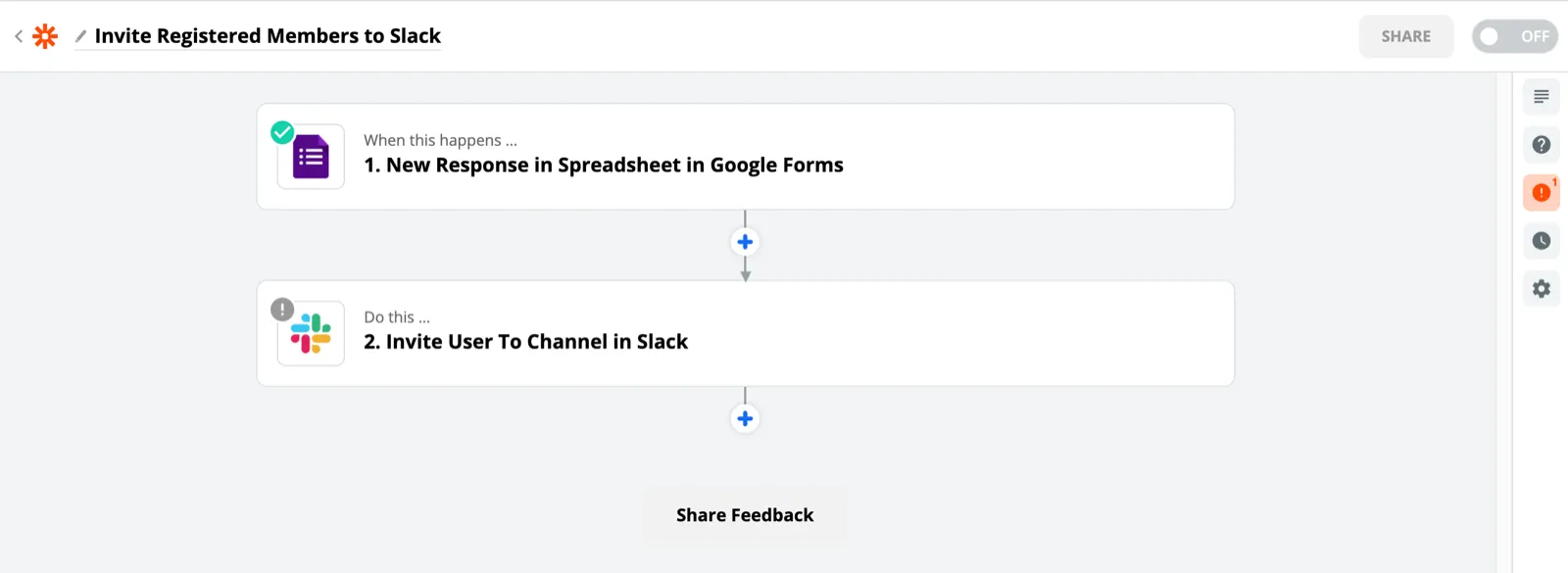
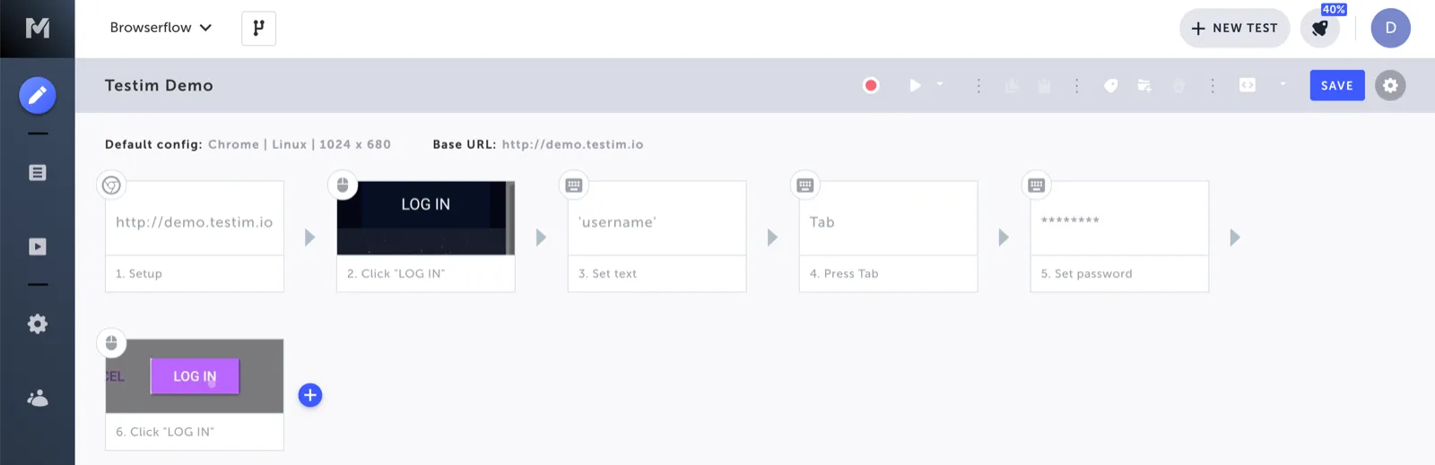
I initially avoided that design given Browserflow’s limited screen real estate. Unlike these full-screen sites, Browserflow is designed to be used alongside another browser window which holds the site to automate. I didn’t want to waste space on putting gaps between commands, but I think I’ll need to given how difficult inserting commands is otherwise.
The other drawback is that indentations for blocks within loops become less obvious. Here’s what a while loop currently looks like:
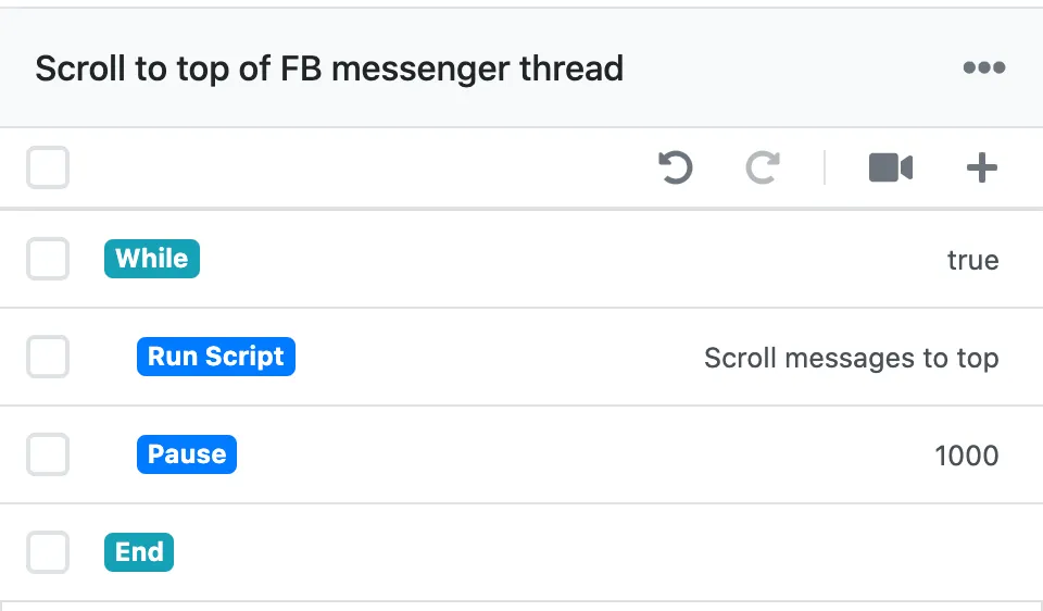
It’s quite clear that “Run Script” and “Pause” are inside the while loop, but that’d be less clear if there were gaps between the commands. Perhaps I can try adding the plus button between commands on hover without creating a gap to mitigate both of these concerns.
AI (P2): Include a button to add a command before and after every command
\2. Find and click the button to add the command
Despite adding a command being the most important action, the current editor doesn’t make it easy to perform that action. During user testing, people often take a while to figure out how to add a command. I believe it’s likely due to the fact that the buttons for doing so are fairly subdued (it’s the “+” button in the toolbar and the “Add Command” button below all the commands).
Compare this to Zapier and Testim, where the buttons for adding a command are more prominent due to using a color that pops.
AI (P2): Make “add command” button more prominent
\3. Edit command properties
Currently, adding a command adds a “Run Script” command with a script of console.log('hello world'). It would be nicer to allow the user to select which command they want right away instead of having to modify the template command.
AI (P3): Allow selecting command type when adding it, not after
AI (P3): Show description of command next to command name
\4. Finish adding the command
Currently, everything is saved automatically and there’s no button to press to save the new command once you finish editing it:
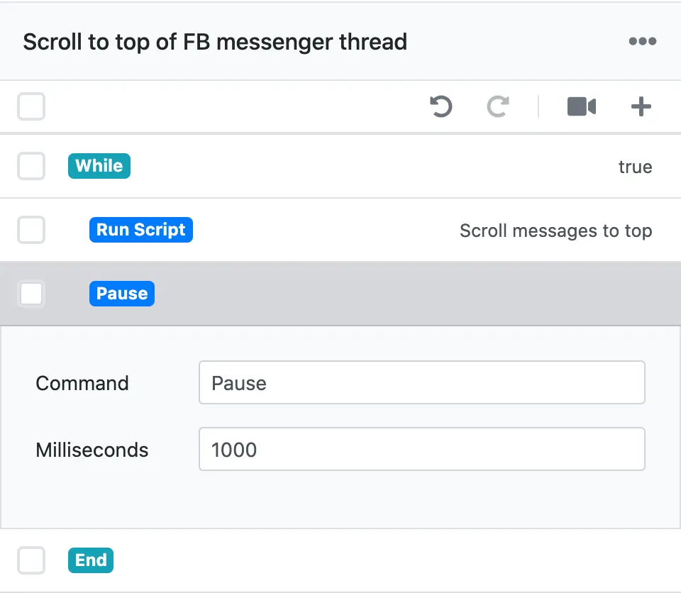
As a result, you need to click on the command header to collapse it instead of clicking a “Done” button. Some users take to this naturally; others have a harder time and wonder if their changes were saved. In order to make it clearer, I might adopt Zapier’s approach of using a “Done” button to finish editing the command fields:
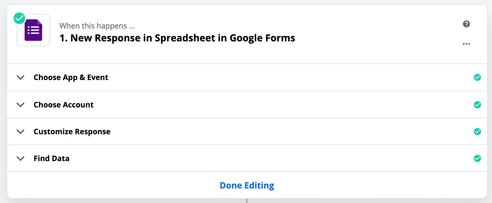
AI (P3): Add “Done” button to make it clear that changes are saved
Edit a command
Steps involved in editing a command:
- Click the command to expand it
- Edit fields
- Finish editing
\1. Click the command to expand it
If you click on a command in today’s editor, the command expands:
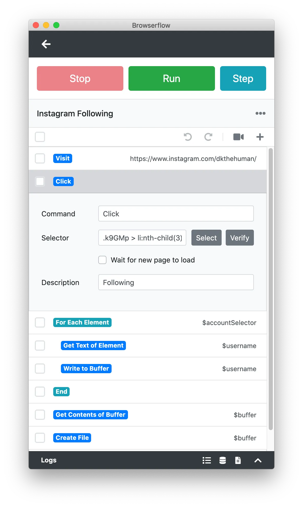
The main issue with this is that it’s not super obvious which command the expansion is for. I mean, most people will assume that it’s for the command they just clicked on, but visually, it’s a hot mess because it’s just squished in there. If I created gaps between commands, this would be a non-issue.
I’ve also considered changing the entire view to a “command edit” page rather than expanding the command inline. The benefit would be that there’s more surface area for all of the command’s fields, but the downside is that you lose the context of the command (what commands came before, what commands came next, etc.)
I’ll keep it inline but improve the visual delineation.
AI (P3): More strongly associate command details to the command that it belongs to
\2. Edit fields
There are quite a few ways to improve how commands are edited. I’ll name some of them here, but they require an entire post unto themselves:
-
Variables
- AI (P2): Autocomplete variable names
- AI (P3): Highlight invalid variables (variable references to missing variables)
-
Selectors
- AI (P3): Allow expanding text field to view and edit the entire selector
-
Code
- AI (P3): Allow keyboard shortcuts (e.g. Cmd + / to comment)
\3. Finish editing
Same problem and solution as “Finish adding the command”.
Delete command(s)
Steps for deleting command(s):
- Select commands to delete
- Delete commands
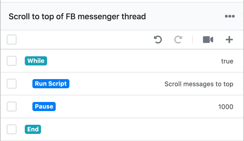
The problem here is that it’s not obvious that you need to select commands before you can delete them. Several test users have tried to delete the command directly from the command, which is understandable. Currently, there’s no UI element that indicates that commands can even be deleted:
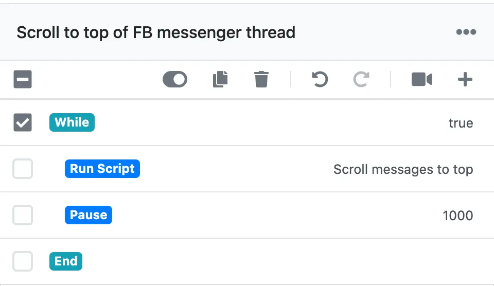
Once you select a command, then the “Delete” icon appears:
AI (P2): Allow deleting a command without selecting it
- Probably best to add the triple dots menu icon for each command
It might be worth it to get rid of the whole checkmark UX entirely and only allow actions on individual commands instead. I’m not sure if there’s a strong enough need for performing actions on multiple commands at the same time. I’ll keep it for now.
I’m going to stop things here because this covers the most important actions and there are more than enough things for me to fix already!
AIs
-
Add command
- AI (P2): Include a button to add a command before and after every command
- AI (P2): Make “add command” button more prominent
- AI (P3): Allow selecting command type when adding it, not after
- AI (P3): Show description of command next to command name
- AI (P3): Add “Done” button to make it clear that changes are saved
-
Edit command (edit functionality AIs omitted)
- AI (P3): More strongly associate command details to the command that it belongs to
- AI (P2): Allow deleting a command without selecting it