Day 538: Stupid Simple
Last week, Chris gave me great advice for improving Browserflow’s onboarding: “Give the user only one thing to do.”
He had told me that after intentionally clicking on all sorts of things that he knew he shouldn’t (e.g. clicking on “Add to Chrome” and being taken back to the Chrome Web Store after he had already installed Browserflow and was going through the onboarding flow). It was funny because he was pretending to be the dumbest user in the world, but he was making a really good point. Things should be designed so that illegal actions shouldn’t be possible. For example, there shouldn’t even be a button to install Browserflow if I know that the user already has it installed.
I’m currently working through the product and trying to simplify things with the principle of making things stupid simple.
For example, when someone creates a new flow, it should be extremely clear what they should do next: Add a command. All the other things you can do with a flow like running it, sharing it, enabling it in the cloud, etc. don’t matter because the flow has yet to be built.
The current design doesn’t reflect that with all the big, colorful buttons everywhere:
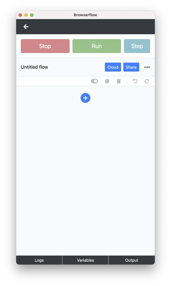
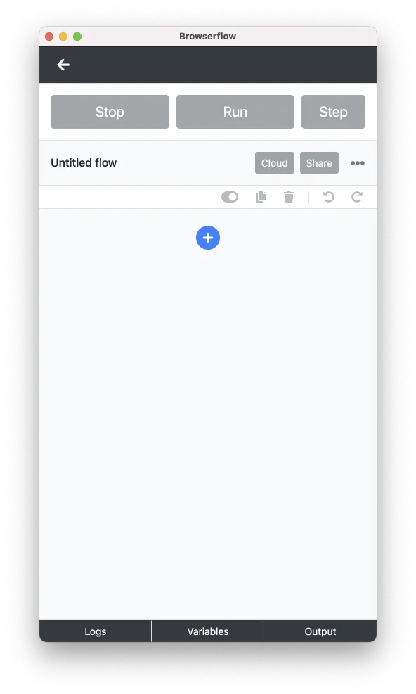
It’s much clearer if I mute everything but the button to add a command:
I considered simplifying this even further and removing all those buttons and controls entirely:
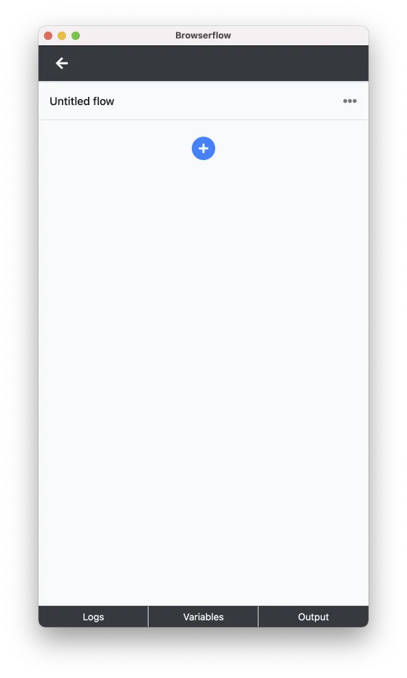
While the simplicity of this last screen is great, the layout shift that occurs when a command is added is a bit too jarring due to too many elements being added at once. For now, the muted version is already a big enough improvement so I’m going to go with that.
The plan:
- Map out the entire onboarding process screen-by-screen
- For each screen, ask, “Is it obvious what the user needs to do here?” and make changes so the answer is yes
- Test the flow on real users and watch where they get stuck
- Repeat this process until everyone can get through it without major issues