Day 101: Improving Intention's landing page
It’s Wednesday now, which means that according to my plans, I should have launched on Hacker News, Reddit, and Product Hunt and that today, I’d focus on reading Traction.
…I just finished Monday’s task of working on the landing page. There’s a good reason for this, I swear.
Before Monday
Let’s take a look at what the landing page looked like before Monday:
Expand to view (or visit the [live snapshot](https://5e6bb33a4321860009e2fc90--getintention.netlify.com/))
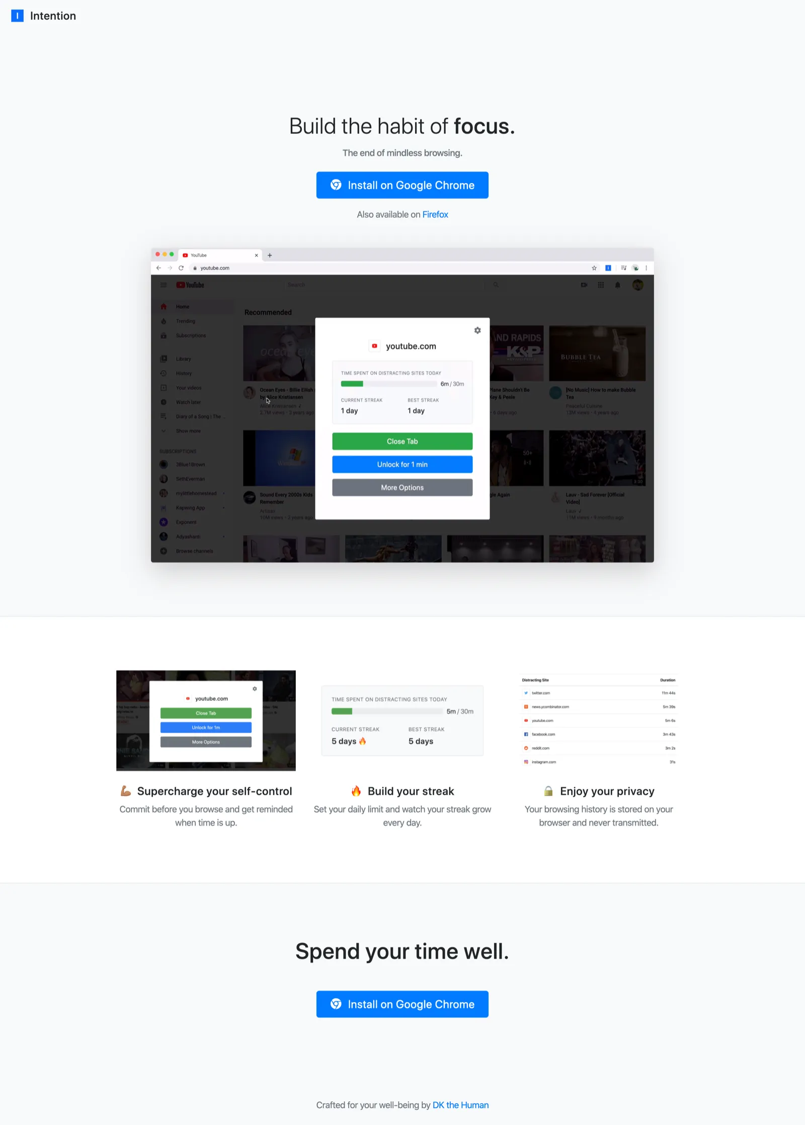
Here’s what’s on the page:
- Hero section with install link and a demo video
- A list of features
And that’s pretty much it. It’s not bad, but I knew that it could use some improvements.
After Monday
After Monday, here’’s what the page looked like:
Expand to view (or visit the [live snapshot](https://5e9552341a8624000697a44a--getintention.netlify.com/))
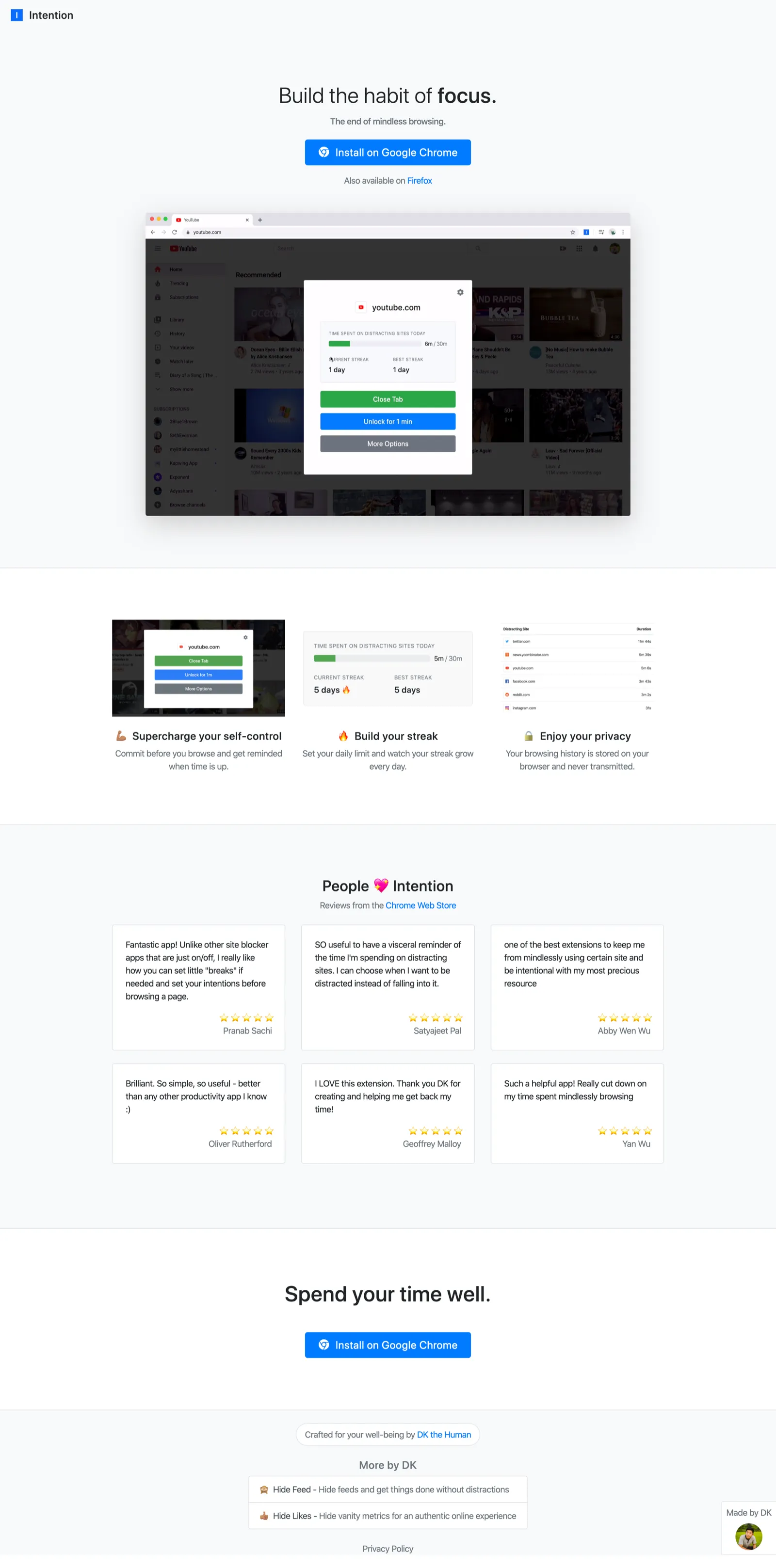
Alright, we’ve got more happening here. I added:
- A testimonials section using reviews from the Chrome Web Store
- A fixed “Made by DK” footer
- A privacy policy link in the footer
- A promo section for my other tools in the footer
With this, I felt ready to launch on HN and Reddit, so I submitted a link on HN and posted on /r/productivity and /r/nosurf.
Hacker News post
Title: Show HN: Intention - Stop mindless browsing
- I asked my housemates about various titles I was considering, and they recommended “Stop mindless browsing” over “Develop the habit of focus”, although they said they liked the latter better for the actual landing page. Their rationale was that “Stop mindless browsing” is more concrete than the vague notion of learning to focus, which I agree with.
- I also debated between “Show HN: Intention - Stop mindless browsing” and “Show HN: I made a browser extension to stop mindless browsing”. I thought the latter might be more compelling due to its personal nature, but one of my housemates strongly disliked it (they also navigated to
hackernews.comto try to go to HN so I should probably take their opinion with a grain of salt… 🤔) Felt like going with the standard title of “Show HN: <title> - <one-line description> couldn’t hurt.
Reddit post
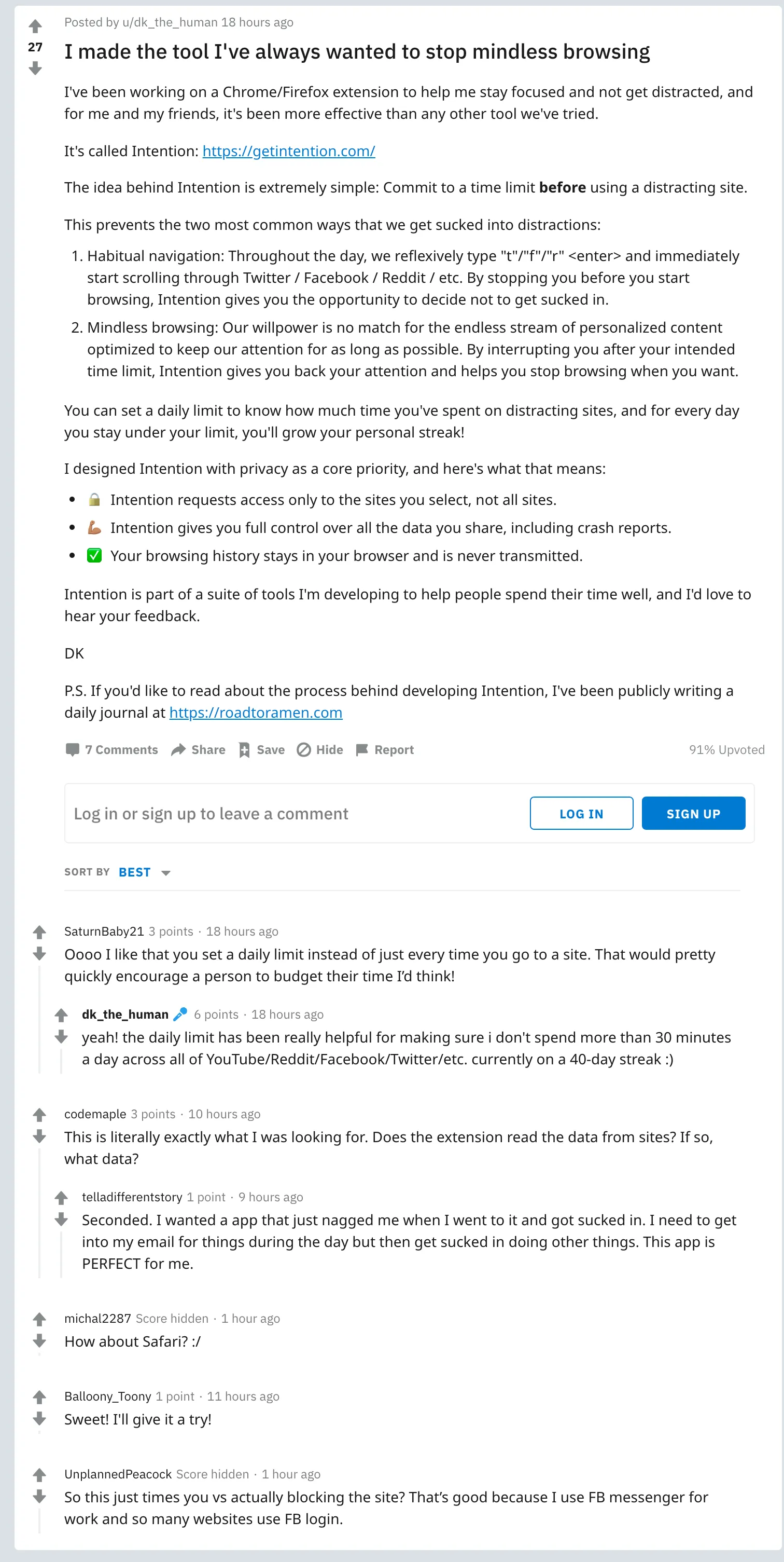
On HN, it quickly fell off the first page of /new without any upvotes so I deleted the link so I could try again some other time, and I hoped that Reddit would be kinder. I was hoping for a steady river of traffic to pour from these subreddits, but instead, I got the trickle of a dying stream. I can never tell whether the post wasn’t good or whether I was just unlucky, but it’s possible that the post was too long (although long posts often do well on these types of subreddits?) and/or I sounded like I’m trying too hard to market my app. (Note to self: “app” sounds better than “tool”)
After I created the posts, I realized that my landing page actually needed a lot more work. In my Feedback Friday posts, I often talk about how landing pages should try to answer two questions right away:
- What is this?
- Why should someone care?
The video explains what it is, and “build the habit of focus” explains why someone should care. But what if they didn’t watch the video? Maybe they don’t want to sit around for 30 seconds. Maybe they don’t like videos. In that scenario, there’s very little else on the page that describes what the extension is and how it works.
After Tuesday
So I basically spent the whole day making changes to the landing page to (1) explain how it works and (2) point out some of the most compelling features.
Here’s the result:
Expand to view (or visit the [live snapshot](https://5e966a24996445000667d15f--getintention.netlify.app/))
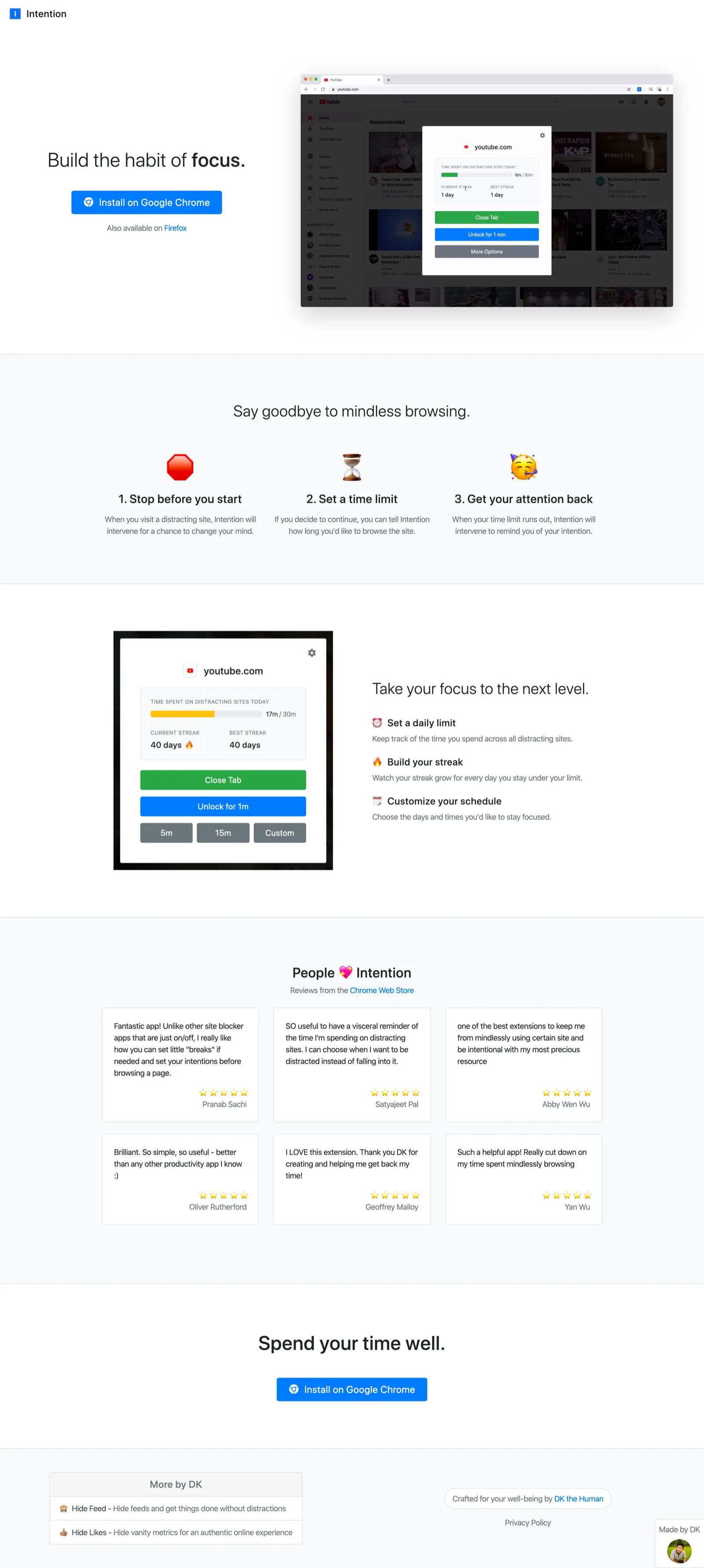
Getting here took a while because I went through many iterations. For example, I originally recorded short video demos for each of the steps about how the extension works but realized it was too redundant with the demo video and threw them all out.
Even though my landing page won’t win any design awards and there’s still a ton of room for improvement, I’m quite happy with how much better it is compared to the previous incarnations. Fitting the video entirely within the viewport on initial load means users don’t miss parts of the video before they scroll, and the additional sections feel clear and concise. Of course, I’m disqualified from evaluating the page’s usability so I’ll need to watch people go through it to see whether it makes as much sense as I hope it does.
Even though I’m a full day behind from my marketing week schedule (I thought I’d possible fall behind but this quickly? bruh), taking the extra time to improve the landing page feels worth it.
Now onto planning the Product Hunt launch!